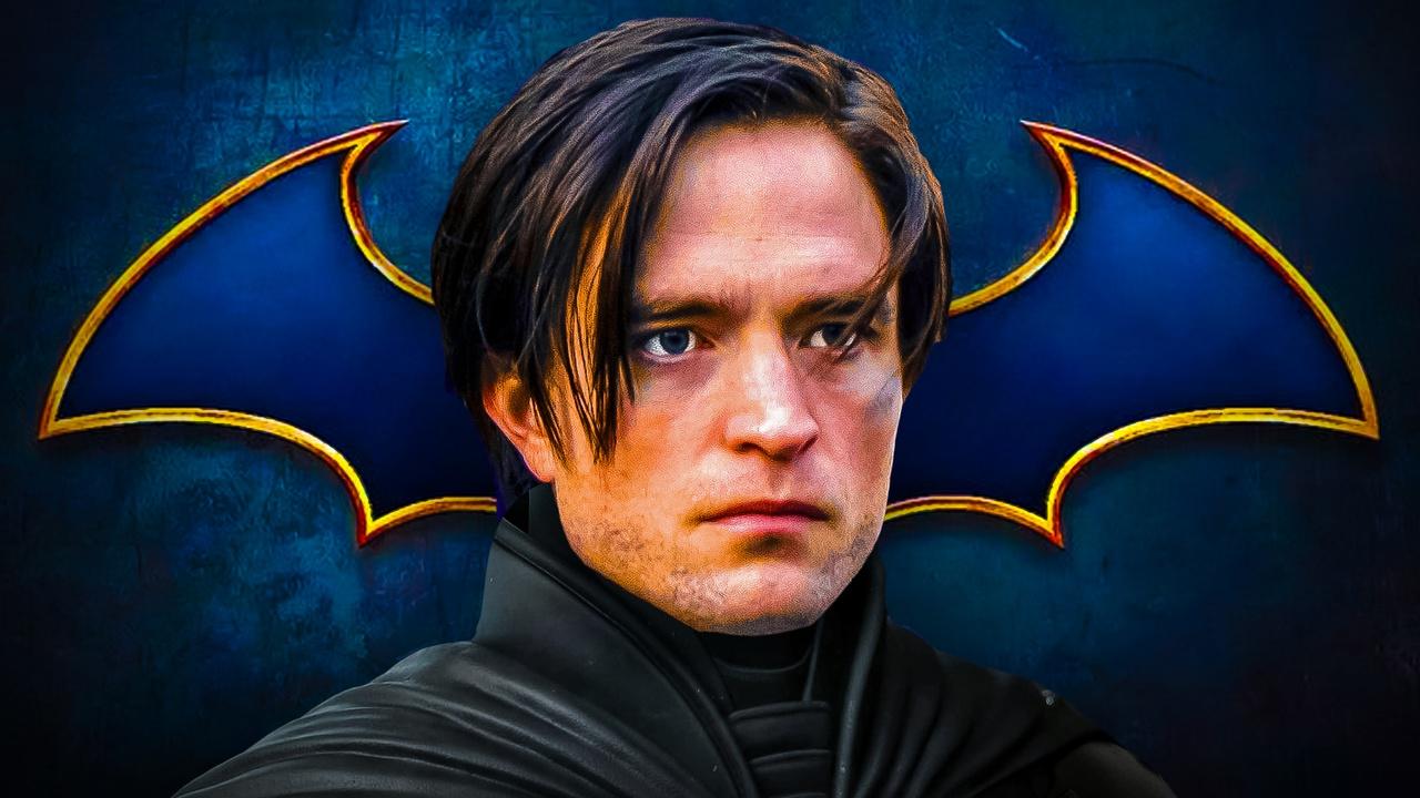
DC officially unveiled a brand new logo for Batman ahead of The Dark Knight's eventual return to the big screen. After being delayed multiple times, The Batman Part II is finally moving forward with Robert Pattinson set to reprise his role. With a filming start set for next year, the film is slated to release on October 1, 2027.
Shortly after the release of James Gunn's new Superman film and the continued updates about The Batman Part II, DC decided to rebrand a few of its most iconic heroes, with the main one being the Dark Knight himself. Specifically, DC recently revealed a brand new logo for Batman that looks different from Pattinson's Batman logo, and any other Batman logo that has been used recently.
As spotted by X user @DCUPRIMETV, the new Batman logo is more rounded and curved on the sides, taking after the iconic logos used throughout the live-action Batman flicks in the late 1980s and 1990s. For reference, Batman, Batman Returns, Batman Forever, and Batman & Robin all used fairly similar logos that look nearly identical to the new symbol that was recently unveiled by DC.
Some fans theorized that DC changing Batman's logo could indicate that the Caped Crusader could be getting closer to making his on-screen debut in Gunn's DCU.
Considering the company also changed other characters' logos, such as Green Lantern's, Harley Quinn's, and Wonder Woman's, it is definitely possible, as there are already major plans for Green Lantern in the first chapter of the DCU, and a Wonder Woman film is reportedly being fast-tracked at the studio.
Even if the Caped Crusader could theoretically debut in a project prior to his solo film, The Brave and the Bold still looks to be a ways off based on Gunn's recent comments about its potential release strategy. Nevertheless, the change could suggest that headway is being made.
The Batman logo change could indicate a few things. First of all, as mentioned, the logo looks very similar to the logos used in the '80s and '90s movies. That could mean that DC is reverting back to its on-screen roots for the Dark Knight, taking inspiration from some of those iterations of the character.
However, it is also worth pointing out that the yellow background of the logo appears to either be concrete or made to look like concrete. Batman has always been a street-level superhero at his core, keeping the citizens of Gotham safe from harm. The Batman provided fans with a gritty, street-level story set solely in Gotham, so the background of the new logo could just be staying true to the nature of the character, since it looks like concrete and seems to be representing that grit and street-level heroism.
The new Batman logo is notably very different from recent versions of the logo used in various media. As mentioned, the new logo looks to be reverting back to a more traditional version of the symbol, whereas more recent versions have entirely gotten away from its roots, and, in some cases, didn't even look like a bat.
Recent Versions of the Batman Logo
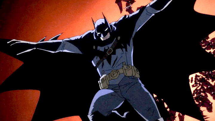
The Batman
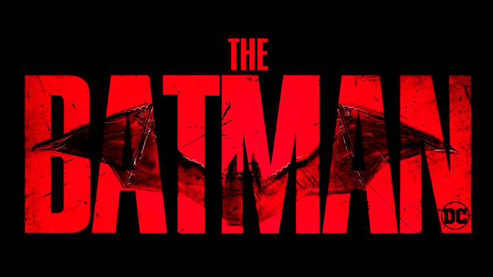
The logo used in Matt Reeves' The Batman was rather unique and different from other Batman logos used in the past. In comparison to other logos, the wings of The Batman's logo looked longer and thinner, making the logo look more like a real bat than any other version.
That logo is expected to be brought back for The Batman Part II, even though it is quite different from the new logo that DC just revealed for the Dark Knight.
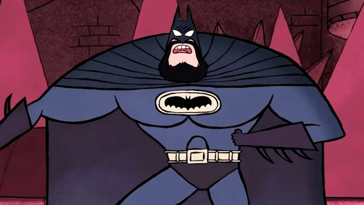
Batman: Caped Crusader
2024's Caped Crusader animated series also brought a unique Batman logo into the world. For instance, the logo is more horizontal than most other Batman symbols, as the top of the wings doesn't have as much curvature as they do in other versions.
It is also worth noting that the logo appeared rather small in the TV series, as it barely took up any space on Batman's chest despite the character's size.
Batman: The Doom That Came to Gotham
While the Batman logo from Caped Crusader was smaller, that was definitely not the case for The Doom That Came to Gotham. The version of the symbol that was seen for that version of Batman was larger than normal, covering nearly all of Batman's chest and even part of his upper stomach.
One notable aspect of that logo that is different from other versions of the logo is that the body of the bat was accentuated in a more dramatic way. For example, the bottom of the bat's body in the logo goes down extremely far. In a lot of other logos, that part of the symbol barely comes down at all (such as in the new logo that DC just revealed).
Merry Little Batman
Merry Little Batman featured a vastly different animation style than other Batman projects, regardless of whether they were animated or in live-action.
To no one's surprise, that meant that Merry Little Batman's logo was also vastly different from other versions.
The wings of Merry Little Batman's logo did feature a more curved shape, appearing more similar to the new logo than something like Robert Pattinson's logo. However, the Merry Little Batman logo does include nine wing points (the little extensions on the bottom of each Batman symbol), which is way more than most versions of the logo feature.
Batman Ninja vs. Yakuza League
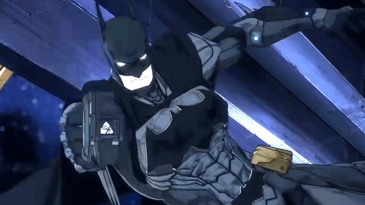
In Batman Ninja vs. Yakuza League (which is a new release), the Batman symbol is another one that is a lot larger than other versions. Like in The Doom That Came to Gotham, Batman Ninja vs. Yakuza League's logo is extremely large.
It is also worth mentioning that it is more of a blocky shape rather than curved. Instead of any of the wings being curved, nearly every part of the logo comes to a point.
Suicide Squad: Kill the Justice League
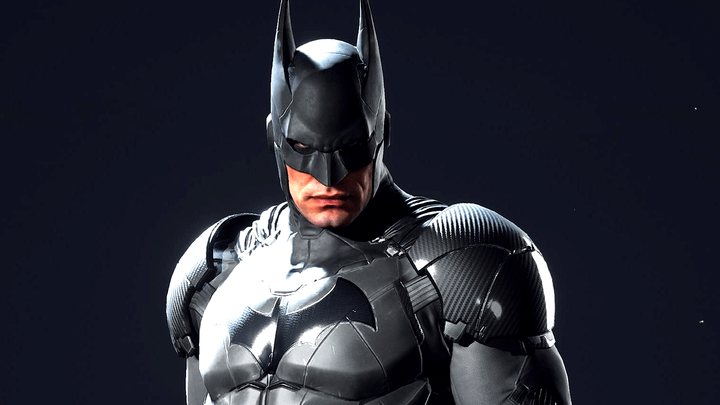
The Batman symbol that was featured in the Suicide Squad: Kill the Justice League video game looks quite similar to the logo used in The Batman. Like in that movie, the video game's symbol has longer wings and looks like it is modeled after a real bat.
However, the Suicide Squad: Kill the Justice League symbol also has some similarities to the new logo, as the ends of the wings are curved on both versions.
Read more about how Suicide Squad: Kill the Justice League ended here.
Absolute Batman
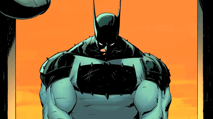
Absolute Batman is a rather new comic book series about the Caped Crusader, and it features an extremely unique Batman symbol. As readers can clearly see, the Batman logo used in Absolute Batman looks nothing like a real bat.
The logo can be better compared to a normal rectangle, as that is basically what it is, with a few wing points, some ears, and a tail.
It is vastly different from other versions of the Batman logo, and definitely does not resemble the new logo that DC just unveiled.


