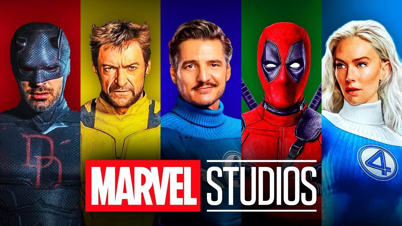
Marvel Studios is rebooting yet another superhero property, its second revamped superheroic 'team,' in its next phase of the MCU. The superhero movie franchise has been responsible for bringing many Marvel Comics heroes to the screen for the first time, but Marvel Studios has also done its share of reboots and remakes of existing superhero movies, putting its own MCU-style spin on the characters.
Individual heroes have tended to receive this treatment in the past, with the likes of Hulk and Spider-Man getting their own spins under Marvel Studios after previous attempts in other film adaptaions. The small screen has also seen soft reboots of past Marvel heroes. Daredevil and Punisher both received solo projects that honored their respective Netflix shows while forging new paths.
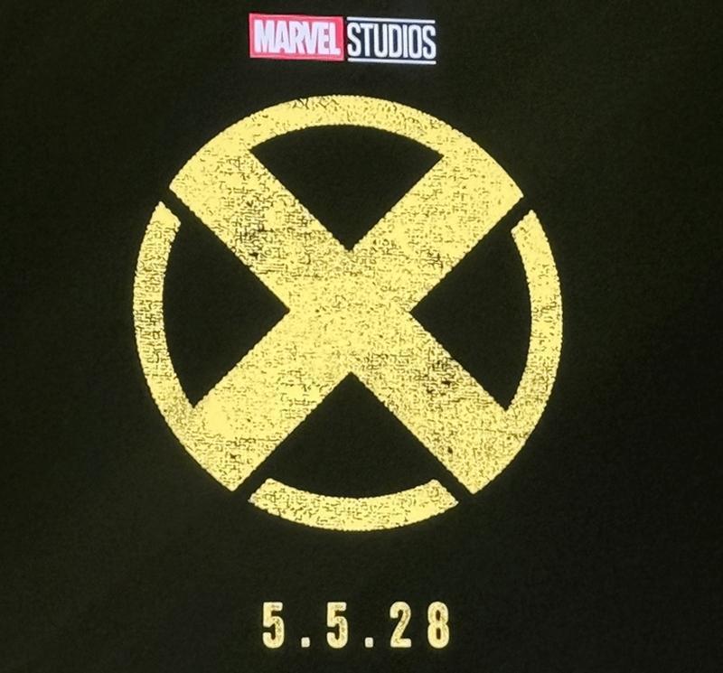
Rebooting entire teams has been more of a rarity across the MCU, though this is set to change for the next saga. The next MCU reboot is the highly anticipated X-Men film from Marvel Studios, which introduces a whole new cast as the iconic mutant superheroes. Marvel Studios unveiled the first official logo for its X-Men movie at D23 in August, sharing a preview of the new "X" treatment on stage and announcing a release date of May 5, 2028.
This follows on from Marvel Studios' first attempt at rebooting a superhero team that was previously not under its purview, that being the Fantastic Four in First Steps.
The MCU will now seek to revitalize a new group of heroes through the X-Men, setting the stage for what could potentially be the next decade of Marvel Studios storytelling should the rebooted mutant team resonate with audiences.
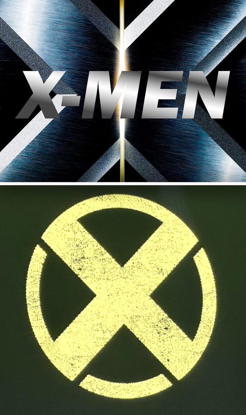
While it's still early days for the X-Men reboot, directed by Thunderbolts*' Jake Schreier, this logo treatment already suggests a vast difference from previous X-Men installments. The vibrant yellow in the logo is reminiscent of the X-Men uniforms introduced by Jack Kirby and Stan Lee in Uncanny X-Men.
The logo stands out against 20th Century Fox's original X-Men trilogy, which opted for a more steely gray aesthetic.
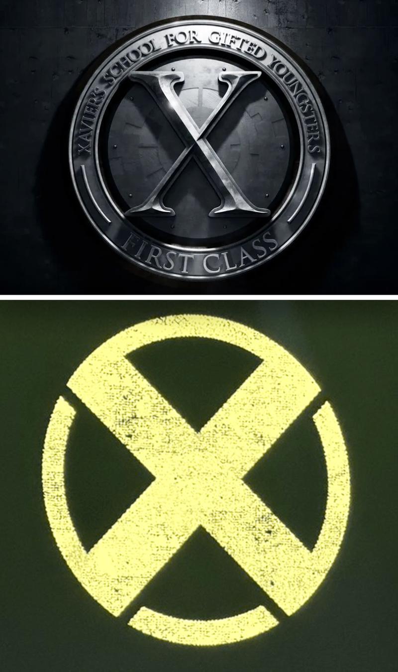
Fox's prequel X-Men movies, which began with X-Men: First Class in 2011, also kept things devoid of bright colors, using a logo that paid homage to the film's primary setting, Xavier's School for Gifted Youngsters.
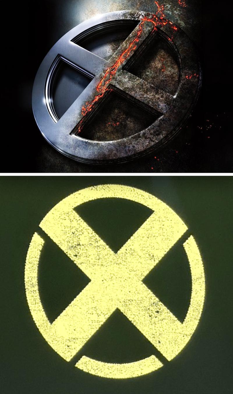
The teaser poster for X-Men: Apocalypse also put a spin on the classic X emblem, showing it fade from sturdy metal into ruin and decay, hinting at the arrival of Apocalypse, the original mutant and the X-Men's ultimate villain.
When it comes to rebooting the X-Men, Marvel Studios appears to want to be as distinct as possible from these past incarnations, particularly given that some of the original X-Men actors will soon be integrated into the MCU in Avengers: Doomsday. Utilizing a bright, eye-catching yellow color scheme sets a definitive tone for Marvel Studios' X-Men reboot, and it's a strategy the studio has used before when rebooting established franchises.
All of Marvel Studios' Rebooted Movie & Series Logos
The Incredible Hulk
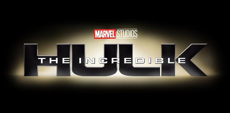
Marvel Studios' second official movie within the MCU rebooted a hero audiences had seen before. The Incredible Hulk released shortly after Iron Man in 2008, with Edward Norton playing Bruce Banner (with Mark Ruffalo eventually taking over the role in the MCU).
This film came five years after the Hulk's first big screen debut in Ang Lee's Hulk in 2003, which featured Eric Bana in the lead role as the mean green fighting machine.
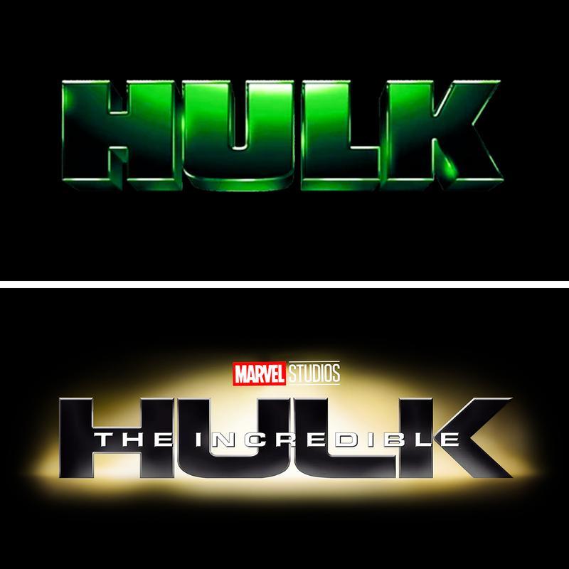
Interestingly, Marvel Studios abandoned the iconic green color scheme of the Hulk for its logo, a move the 2003 film took full advantage of in its own title treatment.
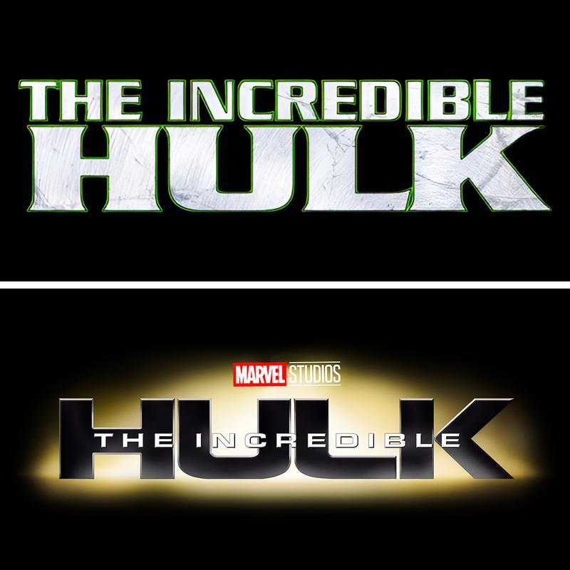
Prior to both of these films, the Hulk had also been represented on television in the 1978 series The Incredible Hulk starring Lou Ferrigno. This logo was less colorful but still featured a green outline to reflect the Hulk's iconic color.
The Fantastic Four: First Steps
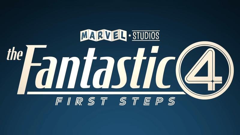
Marvel Studios' The Fantastic Four: First Steps is one of the most recent movie reboots in the MCU, introducing Pedro Pascal as Mr. Fantastic, Vanessa Kirby as Invisible Woman, Joseph Quinn as Human Torch, and Ebon Moss-Bachrach as The Thing. The only other superhero team to get rebooted in the MCU, Marvel Studios leaned hard into the retro-futuristic aesthetic of the Fantastic Four's alternate Earth, which spread into the marketing with a bold new logo.
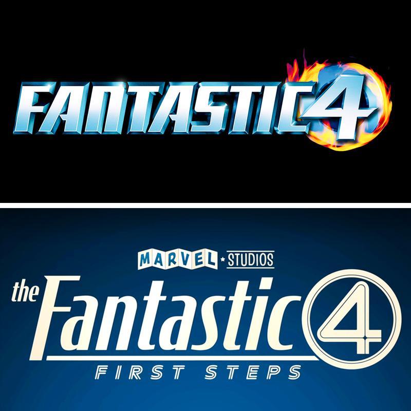
Compared to 20th Century Fox's first Fantastic Four movie in 2005, starring Ioan Gruffudd, Jessica Alba, Chris Evans, and Michael Chiklis, which used bold lettering and a fiery logo, the MCU's version is more intricate and better reflects the film's visual style and world.
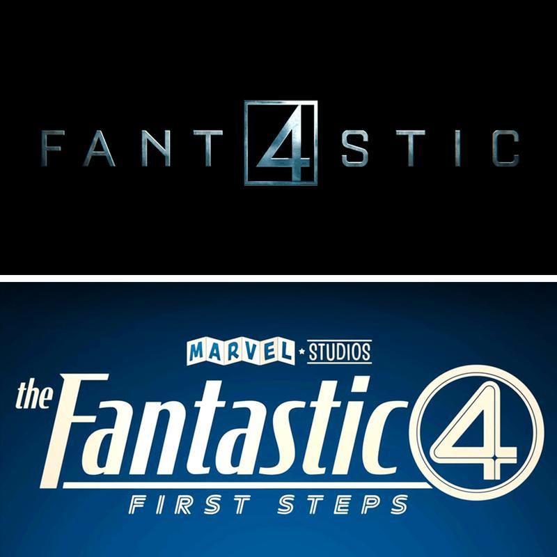
Fantastic Four: First Steps was not the first reboot of the superhero quadrant, with Fox attempting a second take at the team in 2015, starring Miles Teller, Kate Mara, Michael B. Jordan, and Jamie Bell. The logo for Fantastic Four (2015) was a darker take on the superhero team, and it reflects that with a simple metallic font, with the 4 in place of the "A".
Once again, Marvel Studios has tried to stand apart from previous reboots with a much bolder color scheme and style, paying homage to the character's comic book origins.
Spider-Man: Homecoming
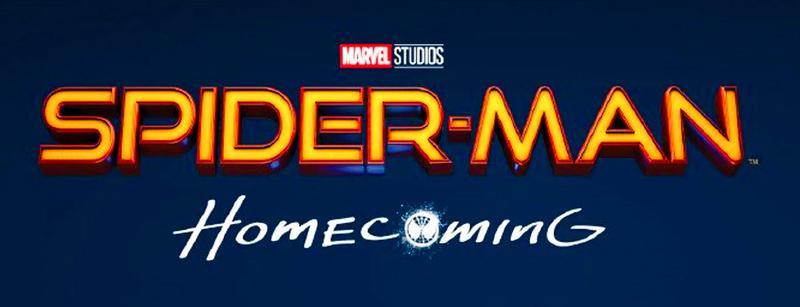
Marvel Studios and Sony Pictures' Tom Holland-led Spider-Man films have become some of the most successful superhero films to date, but they were far from the first to tackle the webslinger. The MCU's version leaned into bright colors and bold lettering for its Spider-Man logo, which made it distinct from past iterations.
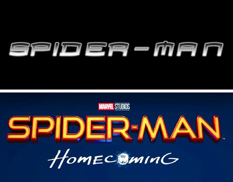
Sam Raimi's first Spider-Man movie in 2002 kept things simple with pointed lettering and grayscale. Sony made three films with Tobey Maguire in the lead role as Peter Parker, which helped pave the way for the current superhero movie phenomenon.
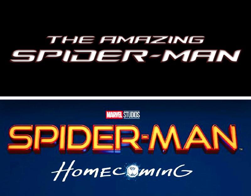
After Spider-Man 4 failed to get off the ground, Sony rebooted Spider-Man with Andrew Garfield in the lead for The Amazing Spider-Man, which received two films. The logo for this reboot was slightly more distinct with bold white lettering, although it still pales in comparison to the Spider-Man color aesthetic from the MCU's iteration.
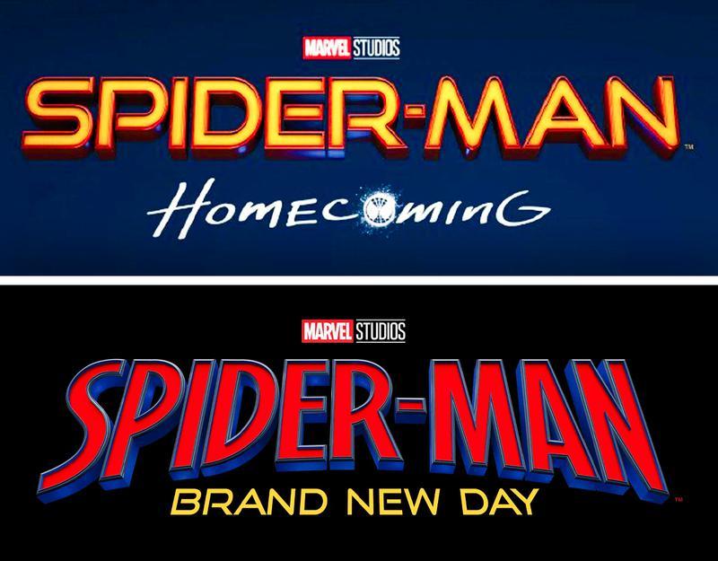
Even the MCU's Spider-Man films have seen a logo overhaul of their own for Spider-Man: Brand New Day, which leaned into the comic book style of Spider-Man's adventures in Marvel Comics, with taller font and striking red and yellow colors.
Daredevil: Born Again
Daredevil is another Marvel Comics hero whom the MCU has claimed for itself in recent years by bringing back Charlie Cox as Matt Murdock in Daredevil: Born Again. Marvel Television's take on Daredevil features a visually striking logo with tall red letters, with the New York City skyline embellished within them.
This logo is an update to the Daredevil reboot's previous logo, which featured a simple white-and-red color scheme.
Prior to Daredevil: Born Again, Netflix kicked off the Charlie Cox Daredevil era in 2015, which ran for three seasons. The Netflix show was not too dissimilar from the MCU's reboot, with bright red font spelling out Daredevil.
Before this, 20th Century Fox had tried its hand at a Daredevil movie starring Ben Affleck as the blind crime-fighting lawyer. Released in 2003, during the early era of modern comic book movies, Daredevil also played on the character's red-suited coloring for its logo.
The Punisher: One Last Kill
After being reintroduced in Daredevil: Born Again, Marvel Studios forged ahead with its own fully-fledged Punisher reboot featuring Jon Bernthal as Frank Castle. The Special Presentation was released on Disney+ in May 2026 and featured a new spin on the Punisher's logo with a grungy look that reflects the character's white-skulled logo.
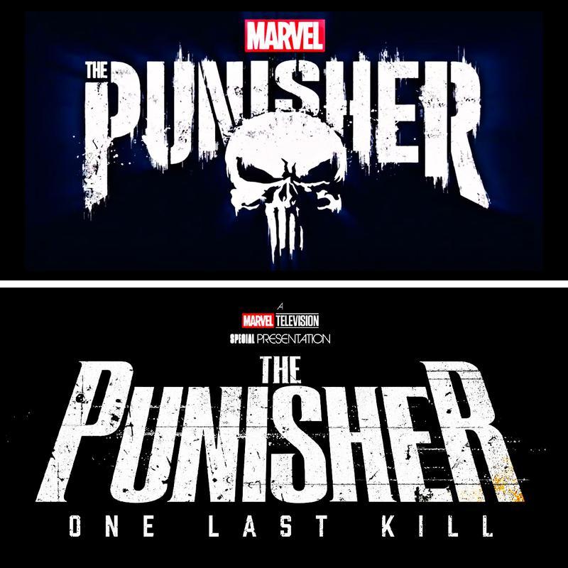
The Punisher: One Last Kill logo somewhat resembles the style of Bernthal's previous Netflix series, The Punisher, mirroring Marvel Studios' approach with Daredevil: Born Again and creating some alignment between the old and new projects. The previous Punisher logo had a white spray-paint-style font and included the Punisher's skull emblem.
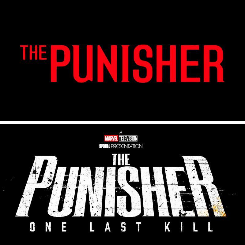
Before the TV reboots, The Punisher was featured in a 2004 film directed by Jonathan Hensleigh, with Thomas Jane in the lead role as Frank Castle. This film took a much simpler approach with its logo, printing the Punisher's name in red.
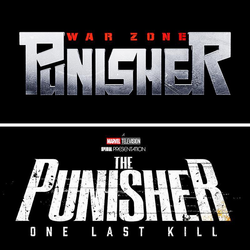
The Punisher was then rebooted again in 2008's Punisher: War Zone, a movie starring Ray Stevenson. This movie took a different approach to the rough-and-tough character, using a logo with a scratched-steel look and red lettering for the subtitle.
BONUS: Ghost Rider
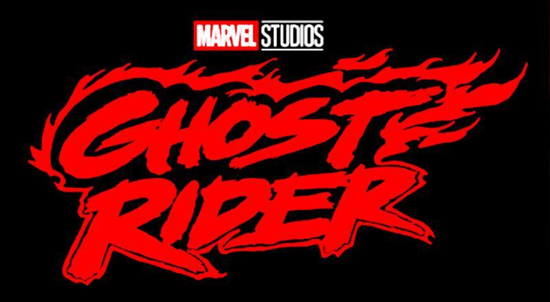
The X-Men reboot is not the only reboot Marvel Studios has planned for Phase 7. The studio's Comic-Con presentation confirmed that a new take on Ghost Rider is in the works for 2028, with Shawn Levy directing and Ryan Gosling starring. The movie also received its first logo at San Diego Comic-Con, which displays the film's title in thick red lettering and a painted rim of flames.
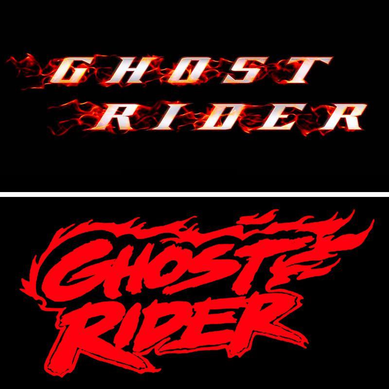
This is a much bolder look than Sony's 2007 Ghost Rider film starring Nicolas Cage. While both films incorporate the flames synonymous with the character's appearance, the old Ghost Rider had subtler, more realistic-looking flames over white text.
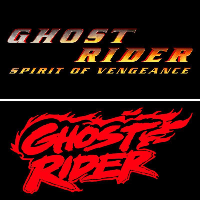
The sequel, Ghost Rider: Spirit of Vengeance, updated things somewhat, losing the flames and switching up its font. The coloring is the main change, with the letters featuring a gray-to-red shading, but it's nothing near as eye-catching as Marvel Studios' rebooted version.
With each reboot, Marvel Studios has taken a strong approach to reclaiming the characters for the MCU, using bright, distinctive logos that often reflect each character's aesthetic.