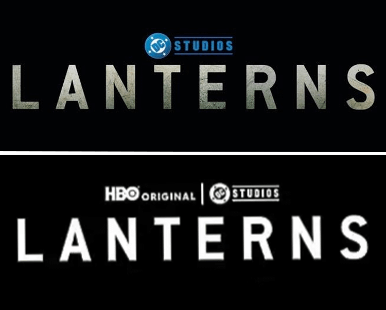
DC Studios officially released a brand-new logo for Lanterns, and it was almost perfect due to the choice of color in its design. The logo of the upcoming HBO Max series has been making headlines in recent months, mainly due to the idea that it appears to be teasing a major Justice League villain in the form of the Centre, though nothing has been confirmed yet (for obvious reasons). Aside from the villain tease, the Lanterns logo also made history with the inclusion of the "HBO Original" branding, indicating that it has already earned prestige status.
Ahead of its release later this year, DC Studios unveiled a new logo for Lanterns for the show's official shop page, showcasing the usual "Lanterns" text prominently with an emerald-green hue glow emanating from the bottom.

The fact that the new Lanterns logo only has a subtle green aesthetic fading outward appears to be a missed opportunity for the logo's almost-perfect design. Some fans pointed out that it should've embraced more of the green color palette to emphasize the Green Lantern lore of the HBO Max series.
Still, others have theorized that this minimalist Lanterns logo would evolve as the series goes on, with it becoming more and more green in the upcoming episodes of the DC Studios-produced series.
For comparison, the original Lanterns logo only had a white font color instead of the minimalist green approach that this new logo has.

Lanterns is set to push Aaron Pierre's John Stewart and Kyle Chandler's Hal Jordan to the forefront as they experience a murder on Earth that could have cosmic repercussions. Nathan Fillion's Guy Gardner is also confirmed to appear.
Lanterns is set to premiere in late summer of 2026.
Why Lanterns' New Logo Is Such a Missed Opportunity

It's possible that Lanterns took the minimalist approach with its new logo due to the need to be consistent with the unified branding style seen in other DCU projects.
Still, it would've been more impactful and strategic to unveil a new logo that embraced more of Green Lantern's lore, considering that the ring-wielding hero is known as perhaps one of the most visually stunning heroes in the DC Universe, and he is defined by bright, vibrant green energy.
Although the show embraces a more investigative style approach in terms of its storytelling due to its murder mystery vibe, many fans argued that this Lanterns logo is boring because it lacks the bold energy that should've evoked the grand scale of the Green Lantern Corps.
Some have also pointed out that the classic Green Lantern ring emblem should've been added to the Lanterns logo to better capture the hero's essence and make it instantly recognizable for casual fans that this show is part of DC's new shared universe.
Hopefully, as the show's release approaches, DC Studios will release a more stunning new logo to dial up the hype for Lanterns.


