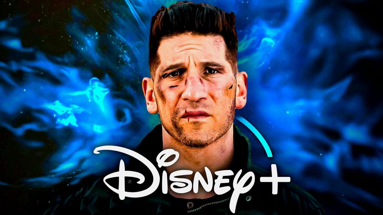
Jon Bernthal’s Frank Castle is heading back into the spotlight on May 12 with The Punisher: One Last Kill, the first solo outing for the character since Netflix pulled the plug on his series in 2019. The one-hour Disney+ Special Presentation, directed by Reinaldo Marcus Green and co-written by Green and Bernthal, follows Castle as he tries to walk away from the skull and build a quieter life, only for an unexpected threat to drag him right back into the war.
Marvel Studios unveiled the official logo for The Punisher: One Last Kill, the third major title to land in the MCU’s ongoing reboot of its Netflix lineup, following the airing of Daredevil: Born Again Seasons 1 and 2. The comic-booky black-and-white version has been prominently seen across the one-off special's marketing, while a second, fiery orange variant was shown in the April 9 trailer.
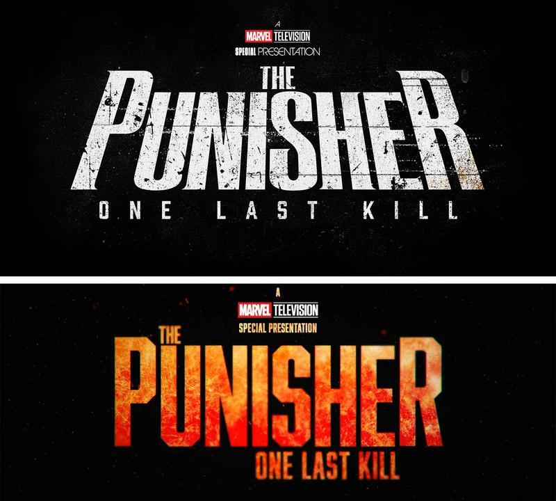
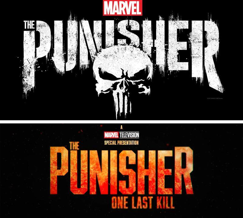
The primary logo keeps things stripped-down and brutal. A distressed, stencil-style "PUNISHER" dominates the frame in cracked white letters, with "ONE LAST KILL" sitting beneath it in smaller font.
Above the title, the familiar "A Marvel Television Special Presentation" banner is situated, placing this project in the same pocket of the MCU as the Werewolf by Night and The Guardians of the Galaxy Holiday Special Disney+ specials.
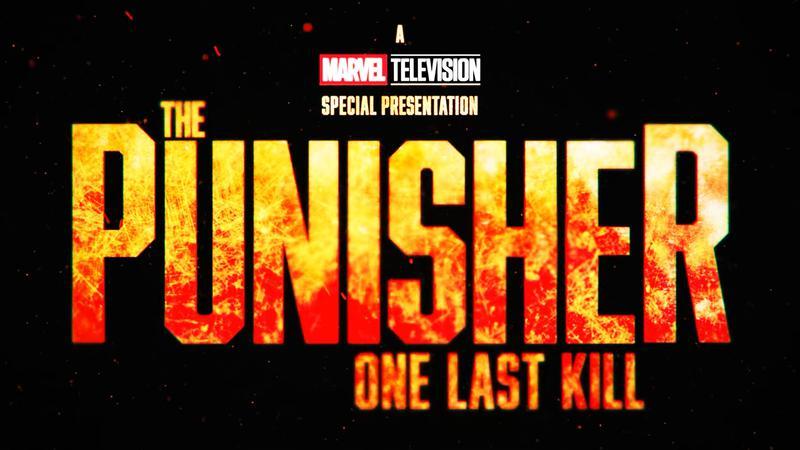
The trailer’s alternate logo trades the washed-out white for deep oranges, reds, and flickering embers, a nod to the now-iconic moment in the footage that shows Castle soaked in fuel and engulfed in flames. This fiery treatment likely lives and dies with the trailer, with the cleaner black-and-white version expected to stay the face of the special on posters, streaming thumbnails, and merch.
Placed side by side, the new One Last Kill logo feels like a direct descendant of Netflix's The Punisher wordmark from the 2017-19 series. The original Netflix design splashed PUNISHER in jagged white paint across a black background, with the skull insignia carved into the negative space of the letters.
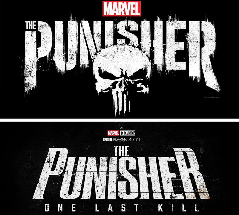
The new Marvel Television version keeps the same grimy, broken-glass vibe, but it's a bit slimmer and more compressed. The embedded skull is also dropped in favor of the "ONE LAST KILL" tagline.
One Last Kill's grimier logo separates it from the other big street-level project in this reboot. Daredevil: Born Again leaned into a cleaner, more modern look for Season 1, with a red skyline motif built into the "DAREDEVIL" lettering.
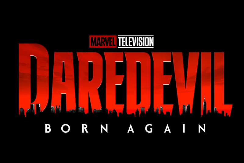
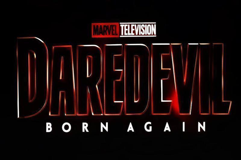
This year's Season 2 inverted the red to black to mirror Matt Murdock’s new suit and the darker tone of the season, making it the first MCU Disney+ series to get a unique variant logo for a second season.
Against those two polished designs, The Punisher: One Last Kill logo looks deliberately rougher, like something spray-painted on a wall rather than rendered in a boardroom, reflecting Frank Castle's own nature.
Before Born Again's post-strike creative overhaul, when the original showrunners, Matt Corman and Chris Ord, were still in charge with plans for an 18-episode legal procedural season, the Disney+ series had a very different logo.
That logo made it clear that Born Again was a full-on reboot of the Netflix series, while the redesign had more similarities to the original show, in line with its newfound status as a continuation (effectively Season 4, 5, etc) of Daredevil.
The Punisher: One Last Kill drops one week after the Season 2 finale of Daredevil: Born Again, making it the next project in Marvel Studios’ efforts to integrate its former Netflix corner fully into the MCU. The trailer’s closing shot outside Gnucci’s Restaurant points to Ma Gnucci as the villain Castle is hunting, one of the most infamous adversaries from the Garth Ennis comic run.
The Punisher's Disney+ Reboot Logo Has a Deeper, Exciting Meaning
The official logos for One Last Kill, as well as the other marketing and promotional materials, tease that the upcoming project is bigger than its Netflix predecessor (The Punisher) in every way. While it is a Disney+ special presentation, One Last Kill feels more like a movie-quality project with a theatrical writer-director (Reinaldo Marcus Green), except cropped down to a high-octane one-hour runtime.
The visual continuity between the Punisher's Netflix and Disney+ logos lines up with what Bernthal and the creative team have been saying about the character. Castle isn't getting a soft reset; instead, he's going to be even more brutal.
The R-rating the project has received is enough evidence that the violence will be next-level. Marvel fans want an unforgiving and menacing Frank Castle. The logo is subtly reassuring them that Frank's fists and guns will still do the talking.
The Marvel Television entry also appears to have a much higher production value than Netflix's Punisher show, which will set it apart from its predecessor and make fans feel like they are entering a new, bigger era with the character.
It is also worth noting that One Last Kill can be seen as a prequel of sorts to Punisher's role in Spider-Man: Brand New Day, so the Disney+ special is a lot more important in the grand scheme of things than many previously thought.


Geraldo Amartey is a writer at The Direct. He joined the team in 2025, bringing with him four years of experience covering entertainment news, pop culture, and fan-favorite franchises for sites like YEN, Briefly and Tuko.


