Following the release of Thunderbolts*, Marvel Studios revealed a brand-new Avengers logo for the film. As Thunderbolts* was gearing up for its theatrical run, many wondered exactly why there was an asterisk at the end of the title. After the movie officially ended, it was revealed that the asterisk meant the Thunderbolts team had become the New Avengers.
Now that Thunderbolts* has been in theaters for nearly a week, Marvel Studios decided to reveal the meaning behind the asterisk at the end of the title in multiple ways. Since the asterisk represents The New Avengers, fans got a look at the logo for The New Avengers, the ninth official Avengers logo from Marvel Studios.
The New Avengers logo is similar to but also different from other Avengers logos used in the past. Notably, the same font for the other eight logos was brought back for The New Avengers, as was the trademark "A" at the beginning of the word "Avengers."

Every Marvel Studios Avengers Logo
The Avengers

The first Avengers logo was created for the 2012 team-up movie that set the MCU apart from other comic book movie franchises. The original logo was rather plain, just featuring text that read "The Avengers" with silver letters. This logo was the blueprint for nearly every other Avengers logo to come in the Marvel Cinematic Universe.
Avengers: Age of Ultron

The logo slightly changed when the Avengers returned for a second team-up film against Ultron, who will be returning to the MCU in 2026. This time, the letters were changed from silver to red, and the word "the" was dropped from the logo.
However, this marked the first subtext used for an Avengers logo in the franchise, as it read "Age of Ultron" in its unique font.
Avengers: Infinity War

When Infinity War came along a few years after Age of Ultron, it once again brought a new logo with it. The design for "Avengers" was kept nearly the same, with only the circle surrounding the "A" a little smaller than before.
The logo's color was changed once again, though, this time to a gold-like appearance. Like Age of Ultron's logo, the words "Infinity War" were given their own font style.
It is also worth pointing out that Infinity War's logo was the first time Marvel Studios put lines above and below the subtitle. The Marvel Studios logo was shown above the Avengers logo for a change as well, instead of the standard Marvel logo.
Avengers: Endgame

The most recent Avengers film went back to its roots with the circle surrounding the "A" in the logo. The color was changed yet again, with the letters being purple this time and including a bit of a red hue at the bottom.
Like past iterations of the logo, the word "Endgame" was given a new font style.
Avengers: Doomsday

The Avengers: Doomsday logo looks quite similar to the past versions of the franchise's logos. However, it was made to represent Doctor Doom by having silver lettering with a green outline since Doom will be such an important part of the film.
The word "Doomsday" is also entirely green, and Marvel Studios elected to bring back the two lines above and below the subtitle.
Avengers: Secret Wars

Even though Secret Wars is still a few years from release, Marvel Studios has already released its logo. It looks similar to the other Avengers logos, with its colors paying homage to the colors of the original Secret Wars comics (red and yellow).
For the first time, though, the Marvel Studios logo was changed to match the colors of the Secret Wars logo instead of remaining red and white as it has done with every other logo.
Read about some potential Secret Wars plot details here.
Avengers: Damage Control

Avengers: Damage Control is a virtual reality video game, but its logo remains consistent with the logos from the Avengers films. Once again, the color was changed and some patterning was added to the letters, but other than that, it looked the same as the movie logos.
Avengers: Quantum Encounter

Avengers: Quantum Encounter is an experience exclusive to the Disney Wish ship on the Disney Cruise Line. It received its own logo, and, like Damage Control, looks nearly the same as other Avengers logos.
However, Quantum Encounter's logo does have a slightly different background.
The New Avengers

However, the word "the" is in a different place in the new logo than it has been. For example, "the" in the original Avengers logo was inside the letter "A." In The New Avengers, the word "the" is before the word "Avengers."
It is also worth pointing out that every other Avengers logo is on a rather clean background. On the other hand, The New Avengers logo is designed to look like something has been torn away, revealing The New Avengers behind the original background. This is because the Thunderbolts* title has been metaphorically and literally torn off.
Thunderbolts*, also known as The New Avengers, was released in theaters on May 2, 2025. The film stars Florence Pugh, Wyatt Russell, Lewis Pullman, Julia Louis-Dreyfus, Sebastian Stan, David Harbour, and Hannah John-Kamen (find out what sets the New Avengers apart from the original team here).
BONUS: Avengers: The Kang Dynasty

At San Diego Comic-Con 2022, Avengers: The Kang Dynasty was revealed to the world, coated entirely in blue with a serif font for its subheading.
The movie has since morphed into Avengers: Doomsday following Marvel Studios' firing of Jonathan Majors, originally featuring Kang the Conqueror in the primary villain role.
BONUS: Avengers: Secret Wars (Original)

At the same time as Kang Dynasty's reveal, Avengers: Secret Wars was also officially unveiled. At the time, the movie's announcement debuted with a completely different logo from the current iteration, featuring an all-black aesthetic.
BONUS: LEGO Marvel Avengers
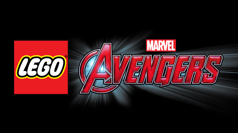
The only LEGO game to be directly based on the Marvel Cinematic Universe, LEGO Marvel Avengers takes this inspiration all the way through to its logo. Taking cues from Age of Ultron's branding, the logo here is also fully in red while incorporating a shining light emanating from behind.
BONUS: Avengers Campus

Perhaps the most different MCU-adjacent logo is the one for Avengers Campus, the Marvel-themed area located at Disney California Adventure and Disneyland Paris.
Rather than using the traditional Avengers logo, this branding only uses the "A" symbol, accompanied by a more rigid, futuristic-looking font for the Avengers Campus text.


