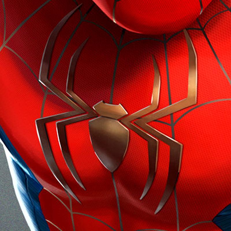
Marvel Studios looks like it fixed one key controversial element of Tom Holland’s red and blue Spider-Man suit from No Way Home.
While his new outfit quickly garnered intense love, in 2022, concept artist Rob Burnett revealed how the suit supposedly featured a golden spider logo on its chest—something that went unnoticed in the final film. For many fans who had considered the suit to be the best one yet, this reveal was controversial, as it did not match the classic look everyone desired.
Last year’s Spider-Man 2 video game seemingly confirmed this further with its in-game version of the suit sporting a golden spider logo clear as day.
Marvel Fixes Controversial Element of Tom Holland's Spider-Man Suit
Thanks to new official blogger photos of its upcoming Spider-Man: No Way Home New Red And Blue Suit release, Hot Toys revealed a massive change made to Tom Holland's outfit that fixes one key controversial detail on the suit.

Taking a closer look at Spidey's chest, fans will notice that the logo is black—and not the gold everyone was led to believe it was.

Previously, concept art from artist Rob Brunette showed clearly the logo as being gold instead of black.

However, with these new images, there is no question the logo is pitch black.

The Hot Toys figure also comes with an extremely detailed and realistic head sculpt of star Tom Holland.

Also included in the deluxe version of the figure is a building rooftop diorama, complete with snow to perfectly set the scene.

One of the photos showcases an example of how the logo could have previously been mistaken for gold as well. In specific lighting, it can sometimes make the black logo seem like shiny gold.

What Is With the Differences in Gold and Black Logos?
So, where are all these Spider-Man suit discrepancies coming from?
Part of it could be how marketing was potentially working off outdated designs. For example, the skin from Spider-Man 2 might have been based on earlier depictions of the now-iconic red-and-blue suit, whereas for this new Hot Toy, the company was able to make adjustments to match the final intended look.
While the gold symbol was nice in that it harkened back to the MCU Spider-Man’s connection to Iron Man, for many, the design choice did not perfectly fit the idea of a quintessential outfit for the hero. The black logo just fits so seamlessly and feels natural, whereas the golden logo stuck out like a sore thumb.
With this new confirmation, some fans will be able to rest easy knowing that the detail has been fixed.
Whatever the case, hopefully, when Spider-Man 4 comes around, fans can see the costume in action and full detail. Though everyone’s favorite wall-crawler is bound to get another new costume at some point, so there’s no telling how long No Way Home’s red and blue suit will last.
Spider-Man: No Way Home is now streaming on FX.
Catch up on other Spider-Man news:
X-Men 97 Writer Confirms What Fans Suspected About THAT Spider-Man Cameo
Spider-Man 4: Jacob Batalon Shares Hopeful Update on Ned's Return (Exclusive)
Invincible Season 2 Finale's Spider-Man Cameo Explained by Showrunner (Exclusive)


