The logo for the upcoming four-part animated series Marvel Zombies marks the first in the MCU to have a prominent portion that shares an identical style and color with its comic counterpart. Though a detail like this may be inconsequential in the long run, it is still fun and interesting to note.
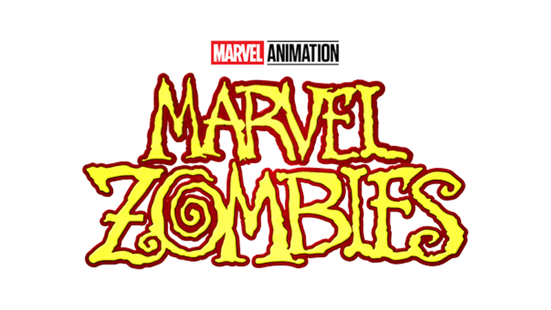
The logo for the Marvel Animation series is yellow with a dark red outline. The font is all uneven, and the "O" in "ZOMBIES" is a spiral.
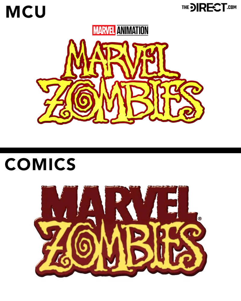
The "ZOMBIES" part of the Marvel Zombies comics logo is identical, though a less bright shade of yellow. Yes, the word "MARVEL" is red in the comics, unlike in the show's logo. But other MCU logos tend to match style or color, never to the same extent as with Marvel Zombies.
It is worth noting that the Netflix Daredevil logo matches its comics counterpart almost identically in both style and color (though shade can vary). But while the first three seasons of Daredevil are canon to the MCU's universe, they are technically not MCU releases.
All four episodes of the TV-MA animated series based on the Season 1 episode of What If...? will be released on Disney+ on September 24. The series will see the returns of many favorite MCU actors, who will voice the animated zombie versions of their characters.
Other MCU Logos Get Close To Matching Comic Counterparts
While Marvel Zombies marks the first MCU project with a logo with a prominent portion matching its comics counterpart's style and color, several others do come close, matching one or the other.
Black Panther
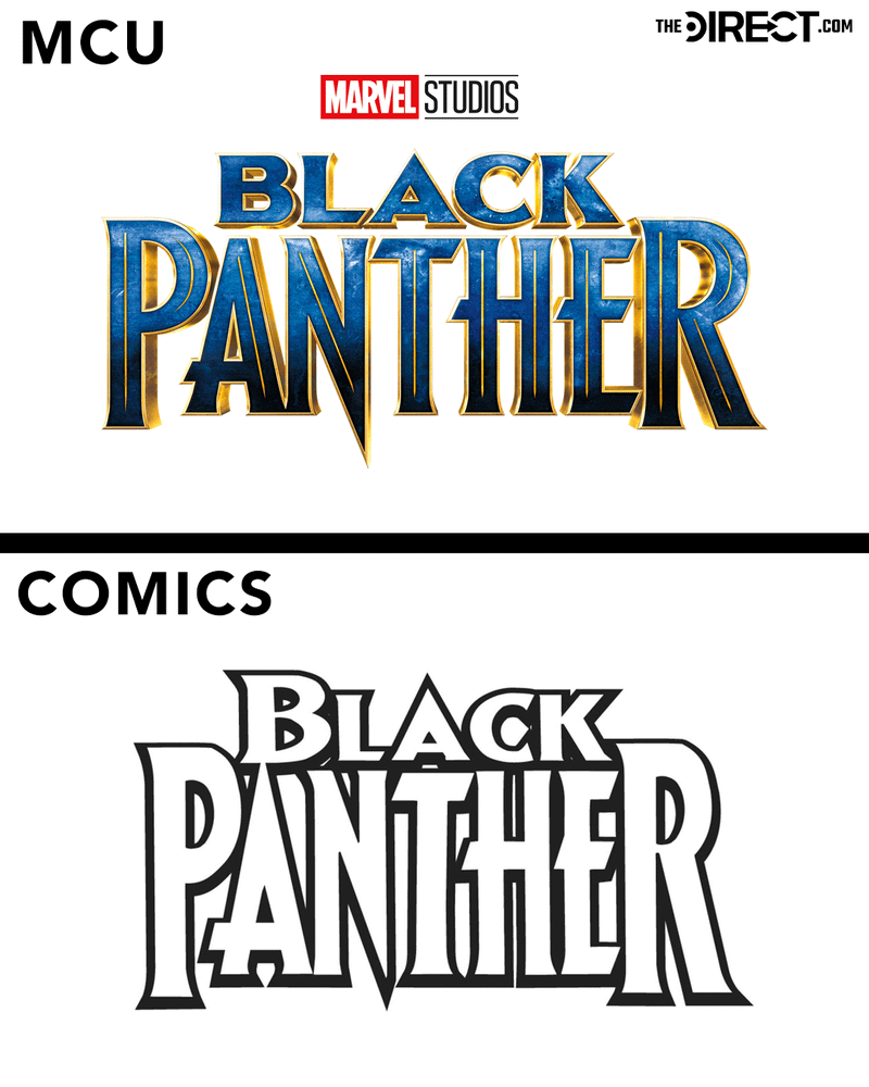
Black Panther's logo, for instance, matches the style of one of the Black Panther comics' logos almost identically, aside from slightly more spaced-out lettering. However, unlike the black-and-white comics version, it is blue, textured, and has a gold outline.
John Roshell designed this version of the comics logo, which was used for 49 issues before making a return 18 years later in the MCU, a fact which "thrilled" Roshell:
"I thought the rendering looked beautiful, and I'm thrilled that that, of all the Black Panther logos throughout the history of the comic, mine was chosen to represent such an amazingly creative and cool movie, and will be forever associated with it."
Hawkeye
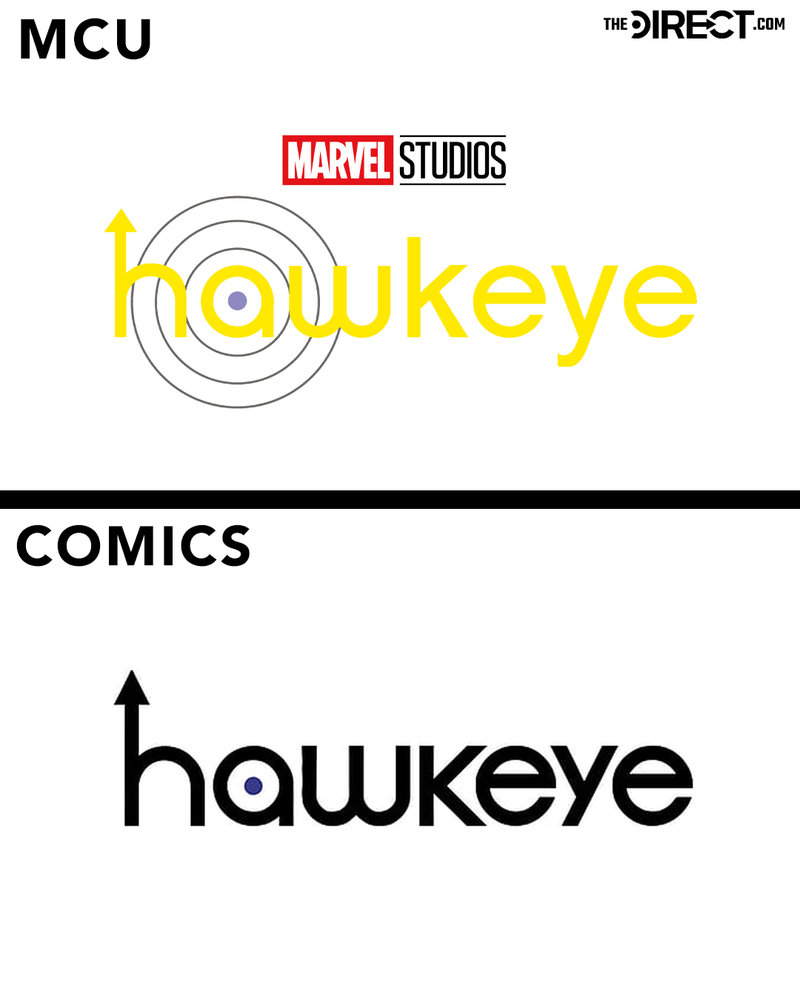
Similarly, the Hawkeye television series used almost the same font (the "y" is more curved in the show version), and the same arrow in the "h" and target in the "a" as the comics did.
The only significant differences between the two are the yellow letters, instead of black like in the comics, and the circles around the "a," in addition to the bullseye at its center.
The Avengers
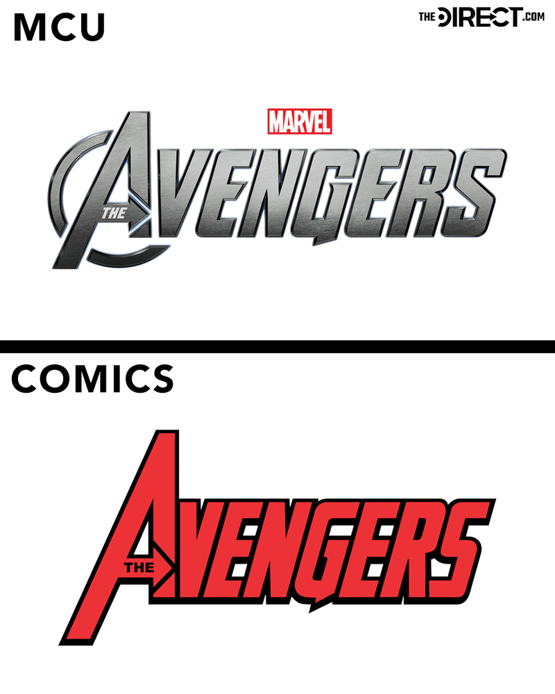
With the noticeable color change (silver in the MCU, red in the comics) aside, the only other main difference between the screen and page logos for the Avengers is an almost-circle on the "A" letter's bottom right for the movies.
Upon closer inspection, it is clear that the MCU version of the Avengers logo has spaces between the letters, unlike the comics. But these are minor changes.
Ant-Man
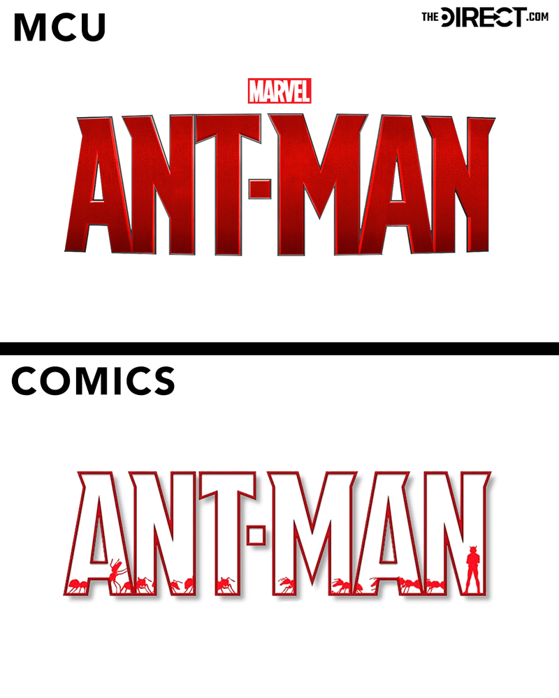
The font and shade of red used in the MCU and comics Ant-Man logos are essentially the same, but there are stylistic differences between the two nonetheless.
Whereas the MCU's logo is filled in red and has a rounder, almost three-dimensional shape, this comic's one is only outlined in red, with little red ants and Ant-Man silhouettes drawn inside.
Ms. Marvel
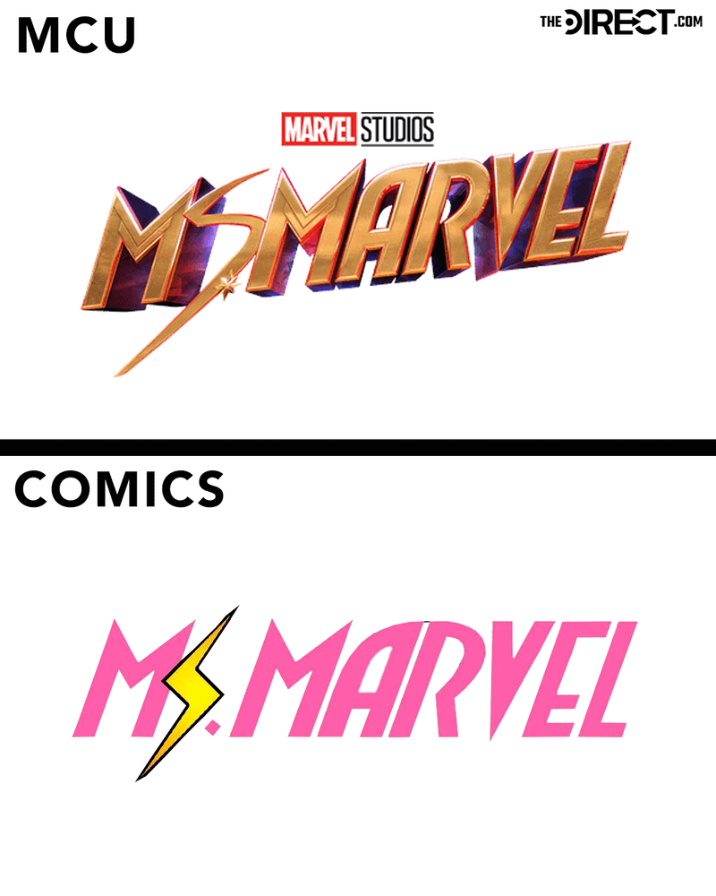
The Ms. Marvel logo seems to have seen the most drastic change of the ones listed here. Still, the inspiration from the "No Normal" comics logo is clear with the lightning bolt S and all-caps lettering. The difference in the lightning bolts matches the MCU Ms. Marvel suit design and the comics Ms. Marvel suit, respectively.
Of course, the two are different in color. The MCU is primarily gold, with a red-and-blue gradient on the three-dimensional sides, and the comics are all pink (besides the yellow lightning bolt "S") and two-dimensional.


Gillian Blum has been a writer at The Direct since 2022, reporting primarily from New York City. Though she covers news from across the entertainment industry, Gillian has a particular focus on Marvel and DC, including comics, movies, and television shows. She also commonly reports on Percy Jackson, Invincible, and other similar franchises.


