Disney and Marvel Studios officially showcased an entirely new logo for 2026's VisionQuest Disney+ series, and it perfectly matches up with the show's mysterious nature and the fact that it is directly tied to WandaVision. Marvel Studios is already off to a hot start in 2026 with its Disney+ content. Many fans praised Daredevil: Born Again Season 2 throughout the Spring season, and then the Punisher: One Last Kill special presentation was highly regarded by many. However, Marvel Television isn't done for the year, as the trilogy started by WandaVision in 2021 is about to be wrapped up.
During Disney's 2026 Upfront showcase (which is an event where a lot of upcoming content is teased and featured), fans were given a special look at a brand new logo for the upcoming VisionQuest Disney+ show. The logo for VisionQuest has remained essentially the same since it was announced, but as its October 14 release date (which was also announced at Upfront) gets closer, things are beginning to change a bit in order to become more marketable.
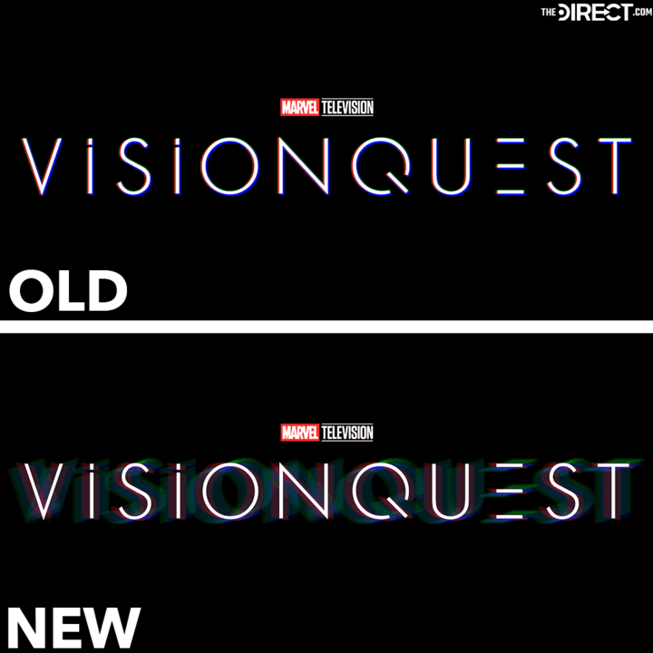
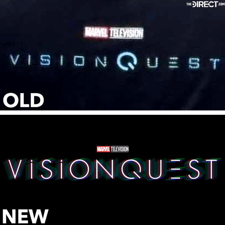
In total, Marvel Television has revealed three logos for VisionQuest since fans learned of the show's title. This new one isn't too different from the one before it, but Marvel clearly added a small detail that makes it much more engaging and teases how the show will include a lot of mystery elements.
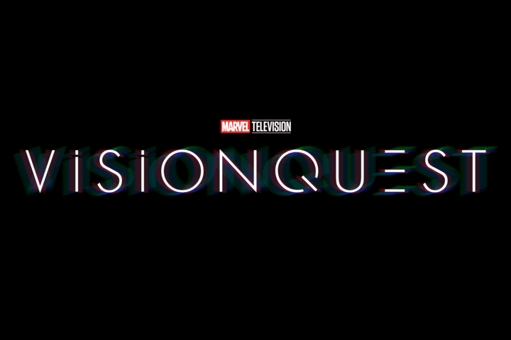
Specifically, the new logo still has the simple font that the previous logo had. However, there is a bit of a glow around each of the letters that makes them look a bit disorienting, as extremely faint outlines of each letter are moved to the right and to the left of the real letters.
The best way to describe it is that it almost looks like there is a bit of an optical illusion or that you are looking at the logo with tears in your eyes, as the glow makes the title look somewhat blurry, and, as mentioned, it is somewhat disorienting.
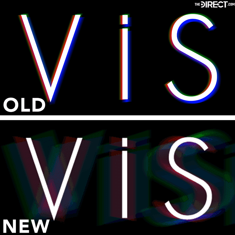
The previous VisionQuest logo had a similar glow around it, but the glow's distance from the true letters was much smaller. Essentially, it was right on top of the letters, so it didn't have much of an effect. The distance for the glow has been increased for the new logo so that it is moved further out from the letters, giving it that specific look.
This is a welcome change to the logo, appearing much more visually interesting in comparison to the original's more subtle chromatic aberration. Additionally, it also better reflects the themes of the series, with the messiness of the colors being reflective of how the show is an examination of this new Vision's fragmented mind.
As mentioned, this is the third official logo Marvel Television has given VisionQuest. The first one had a different font where most of the letters looked a bit more blocky, such as the "s" and the "o." It is worth noting that the original logo's font was also much thicker, so the VisionQuest symbol (which stood in for the "Q" in VisionQuest) was more prominent.
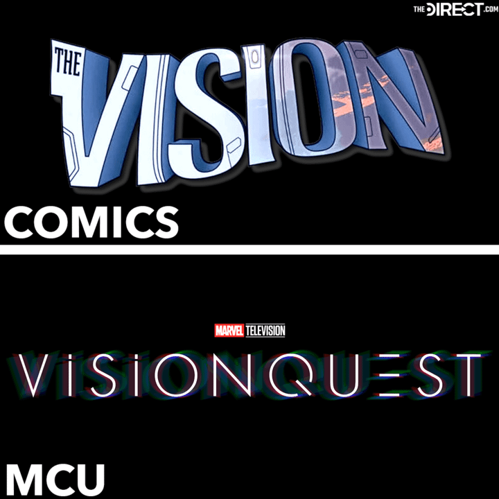
VisionQuest's new logo (and all of the logos for the show that came before this new one) is much simpler and less stylized than notable Vision logos from Marvel Comics. For example, in one of the comics, the Vision logo had different heights and widths for each of the letters, and the letters weren't totally straight. They were also drawn in 3-D, whereas the VisionQuest logo's letters are 2-D.
Notably, the new VisionQuest logo is also much different from WandaVision's logo and Agatha All Along's. Those two Disney+ projects came directly before VisionQuest in a TV show trilogy that the October 2026 series will be finishing.
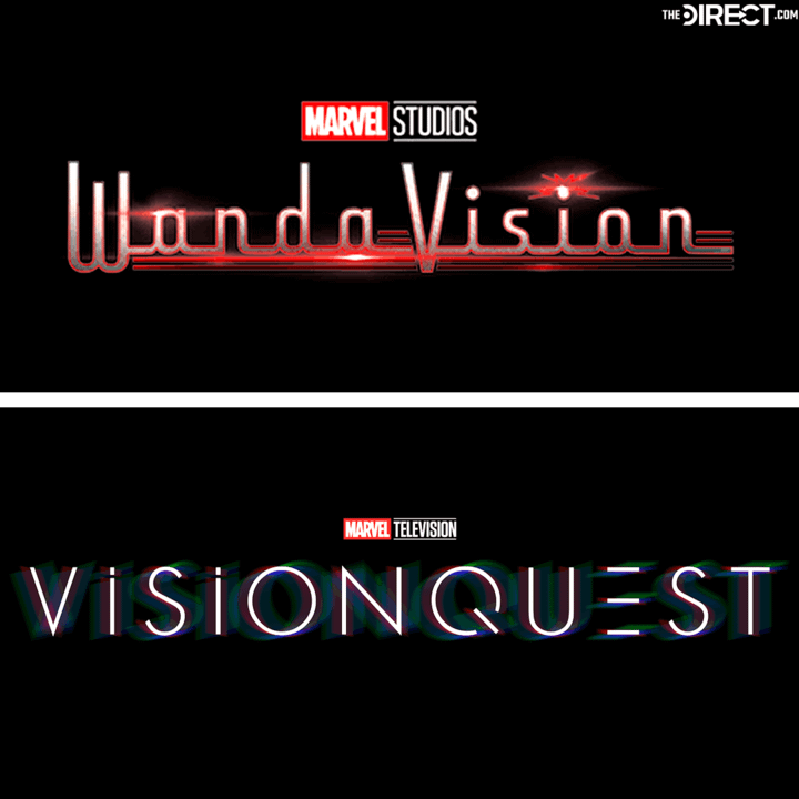
For example, WandaVision's logo was specifically created to have a mid-1900s feel. It had the older style font, and then the red all around it to represent Wanda's powers and how she was secretly in control of everything. VisionQuest's logo does not have as much detail as WandaVision's did, but that is likely intentional.
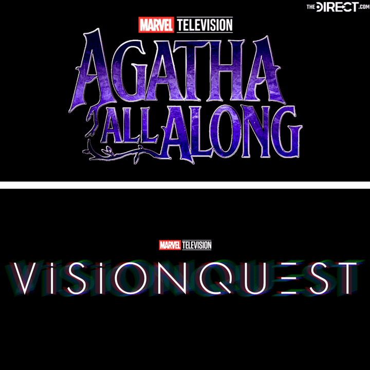
The Agatha All Along logo was the same way. It had bulky letters with a font that definitely felt like witches, and even a couple of the letters had some tree branches coming off of them. Compared to VisionQuest's logo, Agatha All Along's was much more stylized and traditional, whereas VisionQuest's is much simpler and has less flair.
Why VisionQuest's Logo Is Perfect
On the surface, VisionQuest's new logo may not seem all that exciting, and some may even argue that Marvel Television got a bit lazy with it, especially since WandaVision and Agatha All Along had such intricate logos. However, it is important to think about what VisionQuest is all about.
There is a ton of mystery surrounding the upcoming Disney+ series, and no one really knows what to expect from it. Marvel and Disney are keeping details about the show under wraps, but that makes sense considering Vision himself will be in a position where he doesn't really have any idea what is going on.
Essentially, it seems as though Marvel wants fans to feel similar to Vision, and the logo reflects that. That glow that makes the words disorienting could directly represent how Vision doesn't know what is real and what is going on. It has already been teased that a large portion of the show will take place inside Vision's mind and that there will be a lot of misdirection, which can be seen in the logo.
The glow coming off the letters makes it somewhat hard to see the real letters. Since there are really three of each letter, with some more faint than others, it is likely that it is directly teasing that there will be some confusion for Vision throughout the series, and that things may not be what they seem.


