Tom Holland's Spider-Man is getting a new logo in Spider-Man 4, and fans recently got the best look yet at the latest Spidey-themed icon. While yes, Spider-Man has a pretty definitive look, sporting the same buggy eyes and red-and-blue suit in most appearances, every iteration of the iconic Marvel hero has brought its own small changes that set it apart from the others.
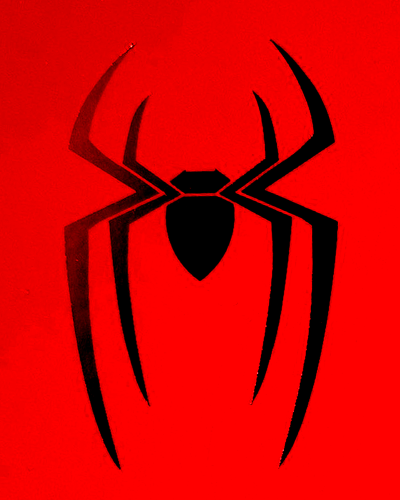
In Holland's history as the Wall-Crawler, this has been brought to life through the various costumes he has worn and the evolution of his signature spider icon. Spider-Man: Brand New Day will introduce yet another take on the legendary Spider-Man logo, featuring large, sweeping spider legs and a more streamlined, smaller body.
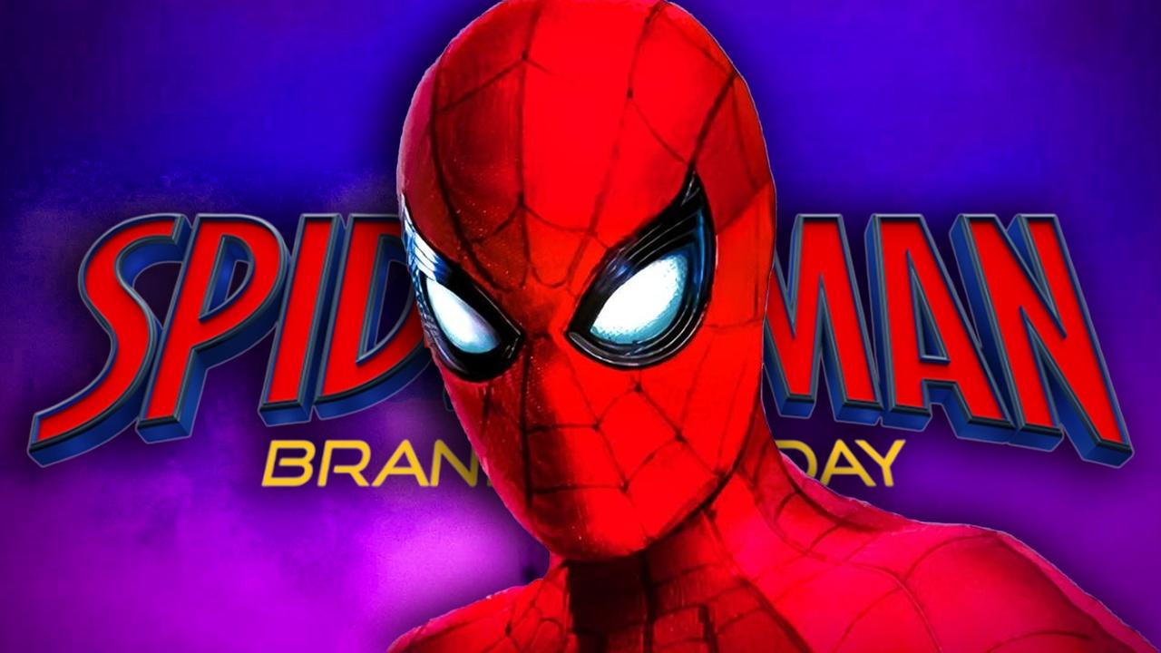
Fans got a new HD look at this Spider-Man 4 logo thanks to a recent social post from one of its crew members. In a now-deleted image shared by an unknown crew member named Will (via Hungarian Marvel Fan on X), the new Spidey icon can be seen in full HD for the first time.
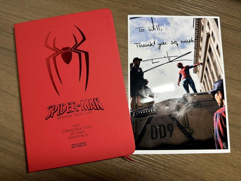
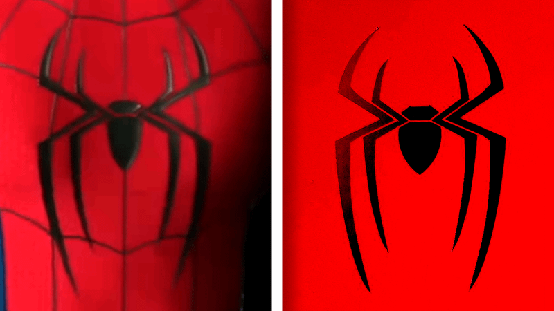
This is the clearest look at the new logo fans have seen to date. The Brand New Day Spider icon does away with the angular design of the character's previous MCU appearance, opting for a more anatomically correct spider design.
A glimpse of the redesign was previously shared by Marvel, showing Holland in the movie's signature, but it was nearly as clear as this new sneak peek.

In the new image, distinct lines between the legs and body are visible, whereas in the original Spider-Man 4 look, those details were blurry enough to be unclear.
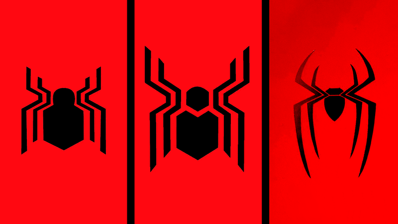
This marks Tom Holland's third overall Spider-Man logo, following the hexagonal, tech-inspired design seen in the first three MCU Spider-Man films. This new take seems to take inspiration from the logos of Andrew Garfield and Tobey Maguire's Spider-Men, as well as comics like the original Ultimate Spider-Man run.
Spider-Man: Brand New Day comes to theaters on July 31. Directed by Shang-Chi and the Legend of the Ten Rings filmmaker Destin Daniel Cretton, the upcoming MCU film will center on Tom Holland's teenage hero, dealing with the decision to have the entire world forget him from the end of Spider-Man: No Way Home.
Why Is Tom Holland's Spider-Man Logo Different?
Tom Holland has not gotten three distinct Spider-Man logos across his time in the super-powered universe, and this latest is easily the most significant departure from the visual identity of the character thus far.
Everything to this point for Holland's web-headed hero had been based on the very angular logo from the original Stark Suit gifted to him in Captain America: Civil War. That spider icon continued to evolve throughout the character's Home trilogy, but it eventually departed from that original design.
Now, however, the wall-crawler is venturing into new territory (at least from a graphic design perspective), doing away with his signature hexagonal logo.
It makes sense that the character changes up his brand identity now, though. Spider-Man: Brand New Day is not just another Spider-Man movie; it marks the beginning of a new era for the hero, finding him at a point where he often ends his first big-screen adventure.
Spider-Man's high school era is over, and now his superhero-ing career can begin in earnest. So, he has a new look to represent this turning of the page.
While wholly new, the logo does feature tributes to what the character has been through to this point. It seems heavily inspired by the logos of Tobey Maguire and Andrew Garfield's Spider-Man, as featured in Spider-Man: No Way Home. After the emotional journey Holland's Peter went on with his Multiversal super-powered mentors, the new spider icon is a way to honor those lessons learned to this point.


