Nintendo officially updated the Super Mario logo in 2026 (and it looks stunning). The Super Mario logo carries great significance to the fledgling video game franchise, as its easily recognizable aesthetic serves as a reminder to those who have and have not played this Nintendo game. Nintendo embraced consistency with the Super Mario logo, almost never changing it unless with slight tweaks. When Nintendo changes the logo, the shift usually signals that a major change for the Super Mario franchise is imminent.
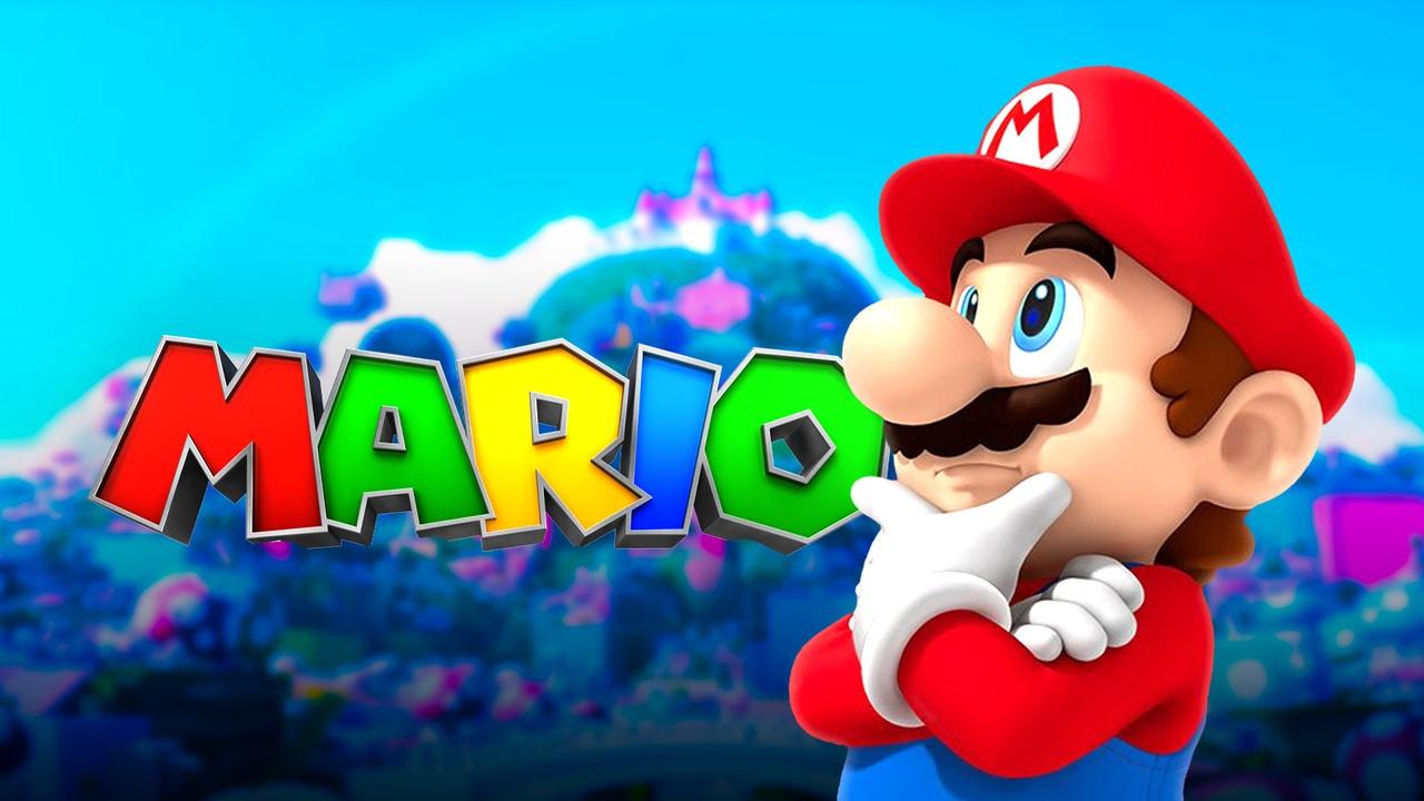
Nintendo quietly updated the official Super Mario logo on its website for the first time in 15 years. While the letters and colors are the same, the change is dimensional, featuring a toy-like sheen and a metallic gray outline where a flat black stroke used to be. The logo appears to emulate a 3D aesthetic, keeping the familiar "SUPER MARIO" wordmark, but giving the letters real volume.
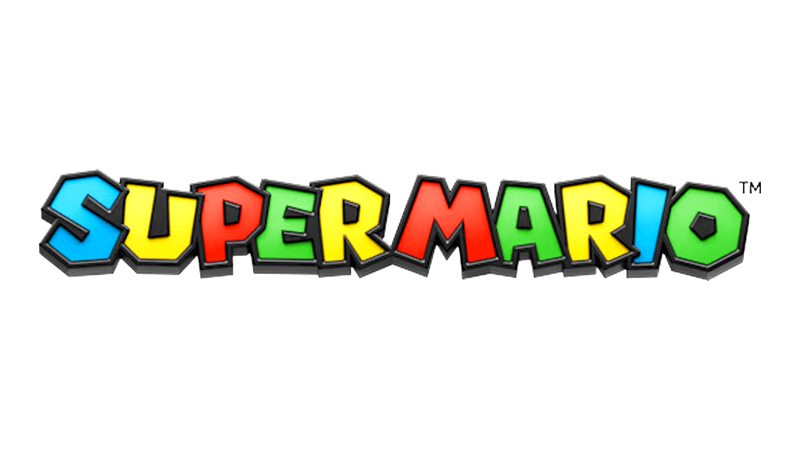
Nintendo's new Super Mario logo evokes the same plastic aesthetic of the Super Mario 3D World video game, with added depth and lightning to highlight the difference.
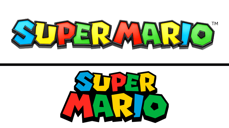
The first consistent Super Mario logo arrived with Super Mario 64 in 1996. In comparison, this classic logo has playful, irregular letterforms in bright primary colors with black outlines and light shading, while the new one feels like a physical object (which is one of the reasons why it stands out more).
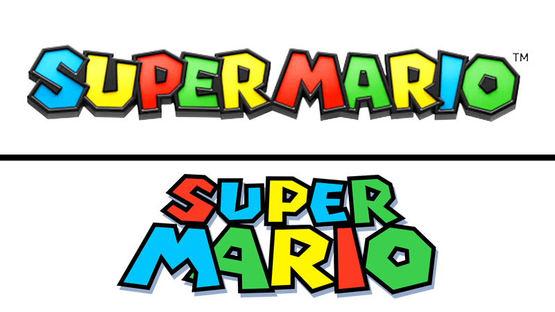
Super Mario's updated 2011 logo for Super Mario 3D Land tightened the shapes, swapped some colors (S is now blue while U is yellow), and added a heavier inner shadow. The letters were made to be slightly pumper and more even, adding more variety to Super Mario's logo lineup.
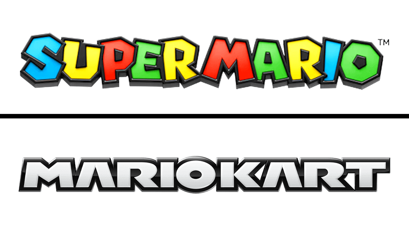
Super Mario's Mario Kart logo keeps the 3D bevel and black shell, but it completely abandons the colorful aesthetic of the other designs. It leaned more toward a chrome design and a machine-like aesthetic reminiscent of the carts used in the game.
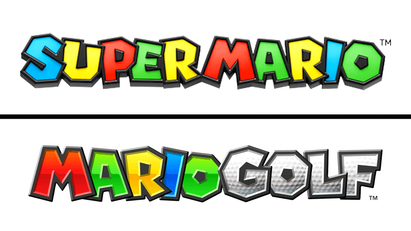
Mario Golf's logo appears to be the one that closely resembles the new Super Mario logo. The "MARIO" part keeps the original color assignment, while the letters in "GOLF" are designed like golf balls with gray 3D sides.
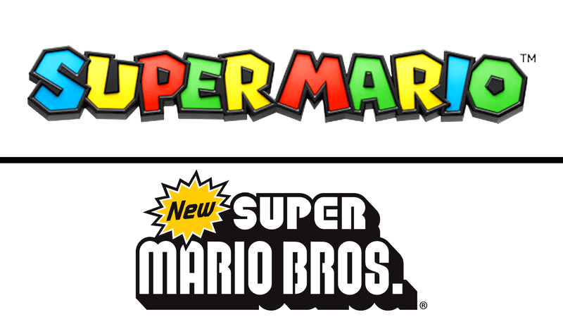
The New Super Mario Bros. design from the Nintendo DS era feels like a reset, showcasing a flat graphic with fake drop-shadow slab and an almost industrial font design rather than the playful one from the 2026 redesign. This change is crucial because it marks a new era, conveying that the franchise is leaning more toward 2D again.
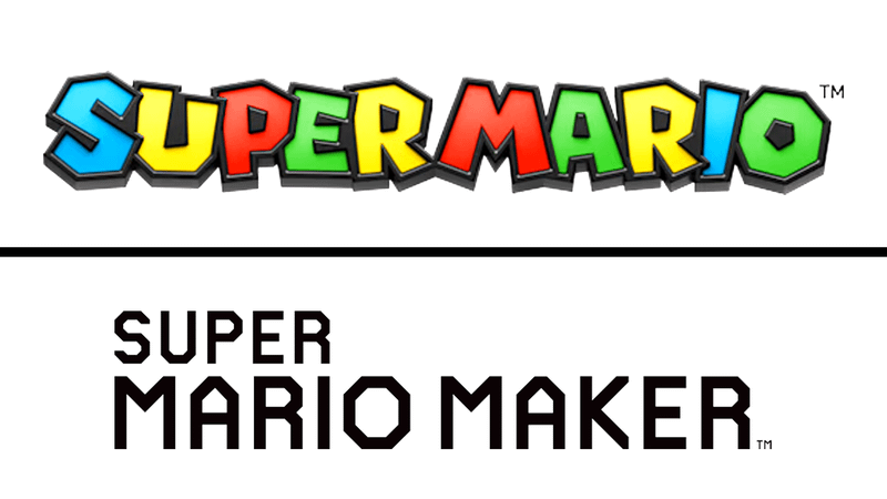
The Super Mario Maker leans more on a simple design, making it stand apart from the rest of the field. It has a flat and heavy geometric font style due to the game's construction premise. Unlike the rainbow 3D logo in 2026, the Mario Maker design emphasizes that this is a different kind of Super Mario experience, as players build levels rather than play an actual Mario adventure.
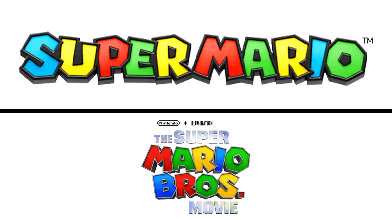
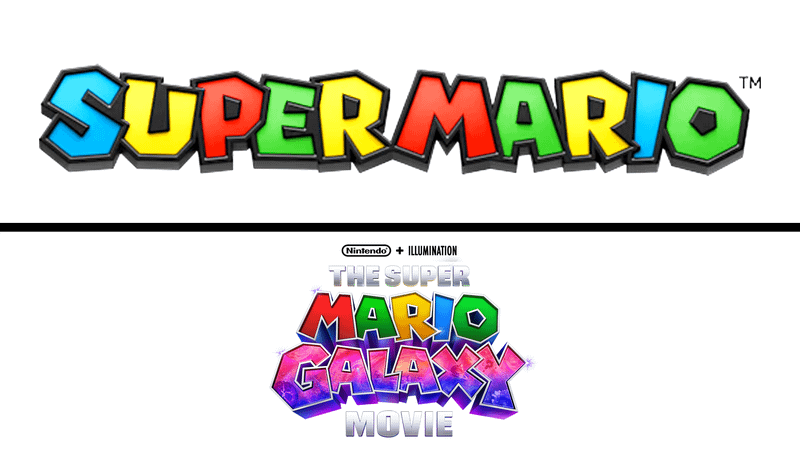
Nintendo's 2026 Super Mario logo and The Super Mario Bros. Movie logo embrace the same design aesthetic. They both have 3D letters, the same color assignment in the MARIO side of the equation, and dark sides and metallic edges. The notable differences include the extra wording and the movie logo's blockbuster title-card vibe.
The sequel, The Super Mario Galaxy Movie, retains the first film's aesthetic while adding the word "GALAXY" to set it apart. The GALAXY design has a wide variety of colors: nebula pinks, purples, blues, stars, and sparkles. So far, this GALAXY part sits further from the usual Super Mario letter system.
The Super Nintendo World logo is the park's version of the same Super Mario logo letter system. It lets the "NINTENDO" wording pop with an all-white color palette with deep shadows, while "SUPER" and "WORLD" emulate the usual color system of the classic Mario logos.
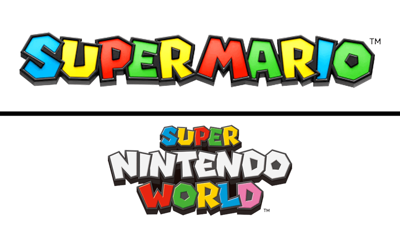
Compared to the 2026 design, Nintendo turned the Super Mario name into a 3D brand object to make it genuinely distinct from the rest while still retaining the iconic franchise wordmark and stylized logos to ensure it remains on-brand.
Nintendo's 2026 Logo Design Signals the Dawn of a New Era for Super Mario
The Super Mario franchise is no longer just Nintendo's flagship video game character, given the widespread success of two highly valued films that effectively cemented Mario's shift into a global movie star. All of this is happening while the games on the Nintendo Switch system continue to thrive with the launch of titles like Mario Kart World, Donkey Kong Bonanza, and Mario Tennis Fever.
Super Mario's (quiet) logo refresh and updated renders signal a new phase for the beloved video game franchise. In April 2026, a report claimed that a Nintendo Cinematic Universe is in the works, and it's a no-brainer to point out that Mario is at the center of this slate, much like how Iron Man shaped the MCU's Infinity Saga.
Following the success of The Super Mario Galaxy Movie, speculation has become rampant about which projects will fill the slate. A third Mario movie is all but confirmed to happen, while spinoffs featuring Donkey Kong and the live-action Legend of Zelda film are also in the pipeline. On the video game side, there is a good chance that another Mario game is in the works to expand the Nintendo Switch 2 library, with rumors pointing to Luigi Mansion 4 or even a next-gen Mario game.
Based on this trend, Nintendo is treating Mario as a multimedia property that lives equally on both the big and small screens. The new 3D logo is a telling sign of the shift in Mario's importance, and the true era of his dominance not only began but is bound to stay.