Marvel Studios revealed a new logo for Wonder Man alongside confirmation that the Disney+ series will return for Season 2. The news comes two months after the ratings-challenged but critically acclaimed series, starring Yahya Abdul-Mateen II and Sir Ben Kingsley, debuted on the streaming platform in January 2026. While the renewal is welcome, if not surprising, news, the reaction to the show’s updated branding has been far more mixed.
The newly unveiled Wonder Man logo, seen in promotional material and online posts, swaps out Season 1's stylized design for a bold, metallic look using the widely recognizable Impact font. The redesign has drawn criticism for feeling generic and uninspired, raising questions about Marvel Studios’ recent branding choices and how this shift could impact Wonder Man Season 2.
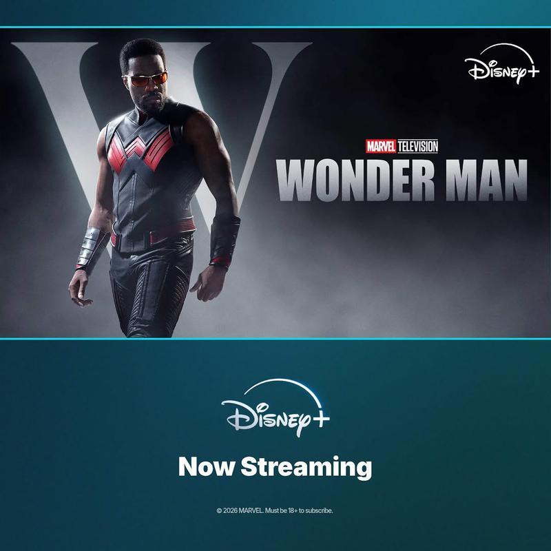
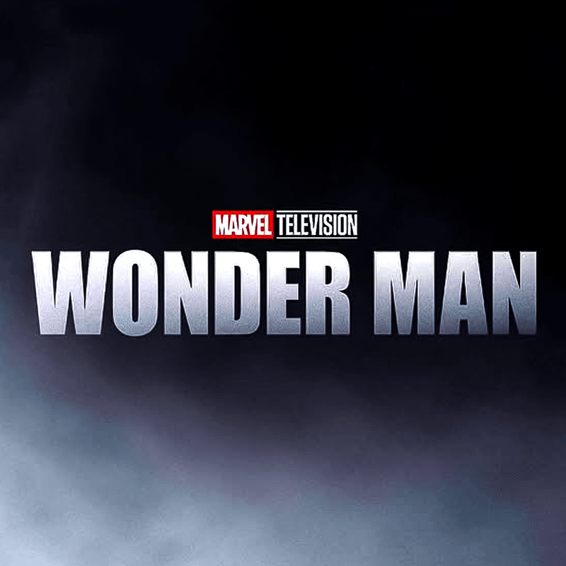
The updated Wonder Man logo features a steel-gray, beveled aesthetic with heavy block lettering, closer in tone to industrial branding than the sleek, retro-inspired look that defined the first season's logo. Most notably, the font appears to be Impact, a typeface long associated with memes, basic design templates, and low-effort visual work.
Digital design culture tends to view Impact as one of the most overused modern fonts, often criticized in design circles as amateurish and unprofessional. Its presence here gives the logo a flatter, more generic feel compared to the original version, which used a Didone-style serif font—clean and elegant, with lines of varying widths, and more aligned with classic Hollywood iconography.
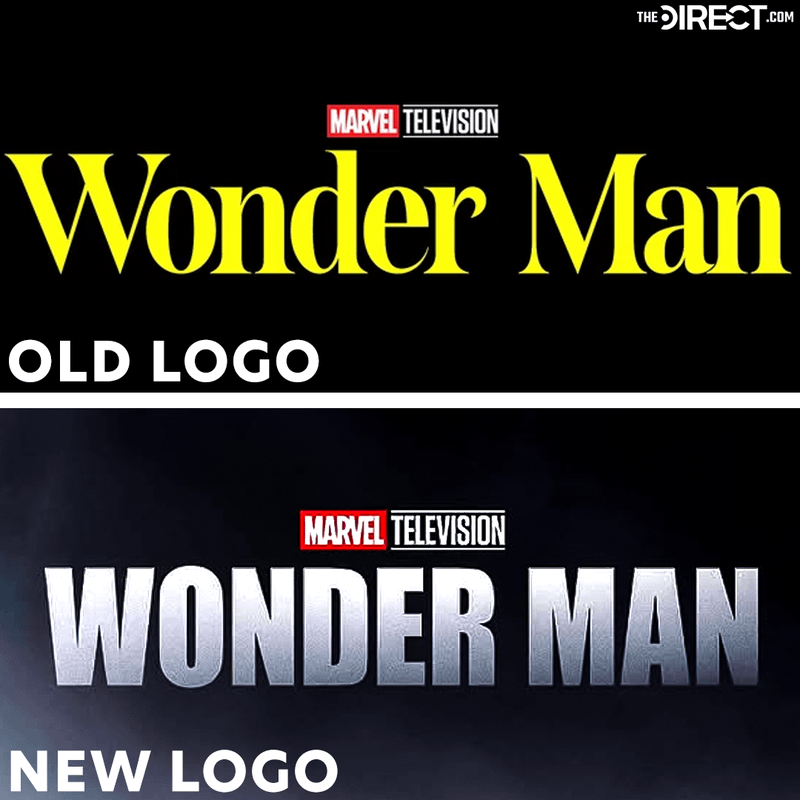
The contrast between the two designs is stark. The original logo conveyed a sense of prestige and theatrical flair, fitting for a character rooted in both superhero action and entertainment industry satire. The new version, by comparison, loses the original's character, trading personality for readability.
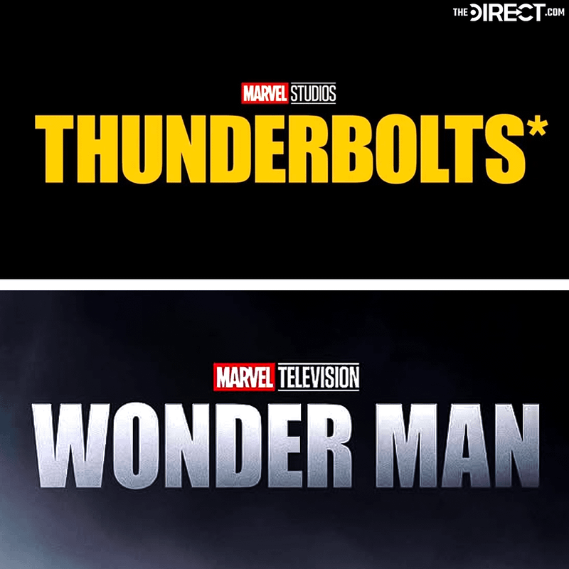
Interestingly, this isn’t the first time Marvel has leaned on Impact. A previous Thunderbolts* logo variation also utilized the font, suggesting this may be part of a broader, if questionable, branding trend within the studio.
At first glance, a logo swap might feel like a minor detail. But for a project like Wonder Man, branding carries extra weight. It’s arguably Marvel Television’s most unique show, prioritizing character work and themes including friendship, loneliness, redemption, and self-sabotage over bombastic superpowers, though Simon Williams possesses many. Those characteristics make its visual presentation especially important.
The original Didone-inspired logo subtly reinforced those themes. Serif fonts like that are often associated with film posters, prestige media, and classic Hollywood, perfectly aligning with Simon Williams’ actor persona. By moving to Impact, Marvel strips away that layered meaning in favor of something far less nuanced and ultimately forgettable.
That shift could suggest a tonal adjustment, which would be a risky proposition considering the first season’s critical acclaim after a string of polarizing projects in the Multiverse Saga. There’s also a broader concern about Marvel Studios’ recent branding consistency. Over the past few years, the MCU experimented with a wide range of visual styles, some successful, others less so. When something as prominent as a series logo feels interchangeable or generic, it chips away at the distinct identity each project needs to stand out.
Ultimately, the Season 2 renewal is the real headline here, and it’s a positive sign for Wonder Man. But the logo reveal has become part of the conversation for a reason. In a franchise built on strong iconography, even small design choices can have an outsized impact.
Marvel may still deliver a standout season when Simon Williams and Trevor Slattery return to Disney+. But based on this first impression, Wonder Man’s new look isn’t doing it any favors.


