Marvel Studios is going all-in with upgrading the Avengers logo ahead of Avengers: Doomsday, but with a Doctor Doom twist. The Avengers logo in the MCU has evolved from a clean symbol of unity to a compelling storytelling device across different movies. Marvel Studios has completely refined the iconic "A" logo across the franchise, adjusting its color, texture, effects, and details to reflect the tone, villain, and story of the respective Avengers film. A similar strategy is being incorporated for Avengers: Doomsday, and the existence of two distinct logo variants signals something bigger for the MCU.
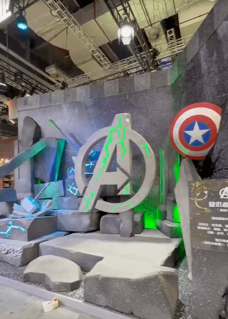
As part of the official display at the 2026 Shanghai Expo, Marvel Studios officially revealed two distinct Avengers logos for Avengers: Doomsday, inspired by Doctor Doom.
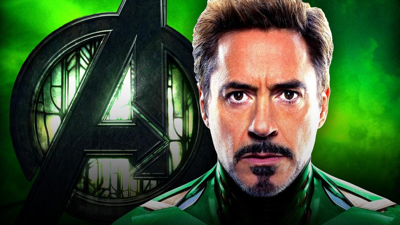
One version (visible at the 0:07 mark in the video below) fractures the iconic "A" with glowing green energy cracks, evoking Doom's sorcery and reality-warping power. Some also claimed that this unique logo could hint at fractured alliances among Earth's Mightiest Heroes caused by Doom's manipulation.
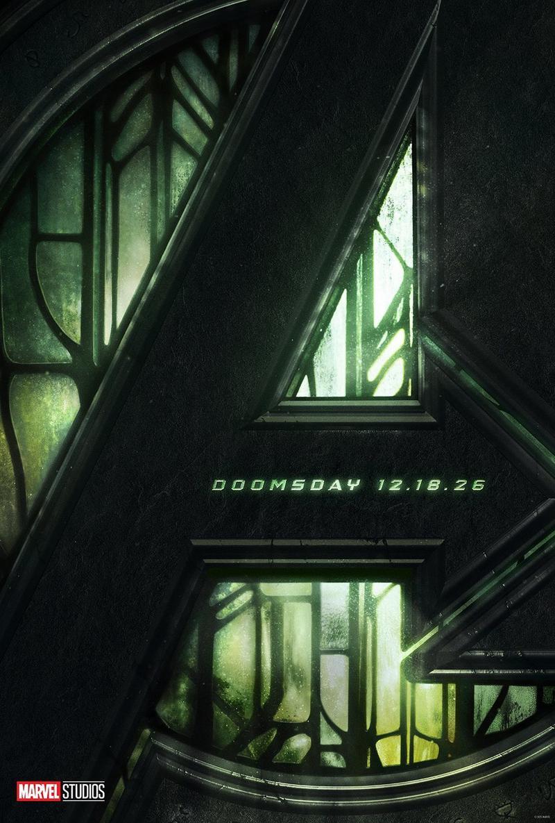
The other sets the "A" logo against the ornate green stained-glass windows, seemingly pulled directly from his Latverian throne room. This logo first appeared on the Avengers: Doomsday official poster, alongside the release of its first online footage.
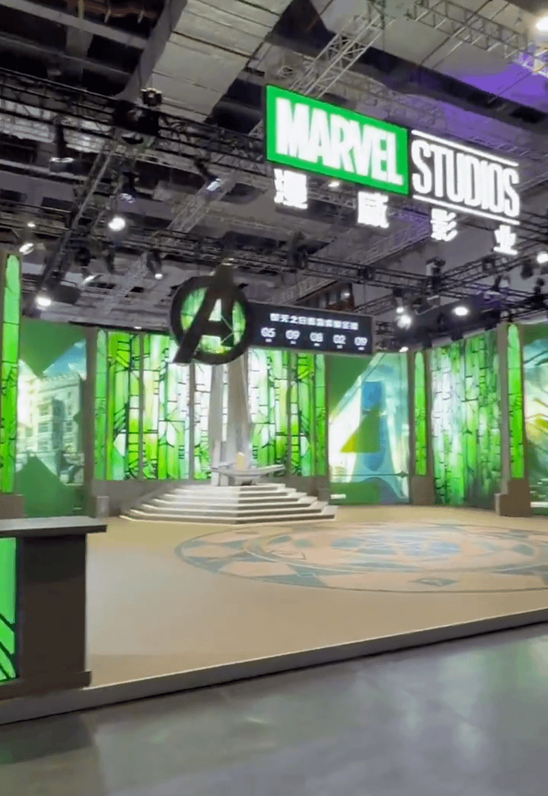
These two logos actually tell a story. It sends a message that Doctor Doom is directly infiltrating the Avengers' core identity, blending his mystical roots with their heroic symbol in a way that feels ominous and manipulative.
Following the release of 2012's The Avengers, the consequent A logos for the next wave of Avengers movies have had something to do with the plot of the film.
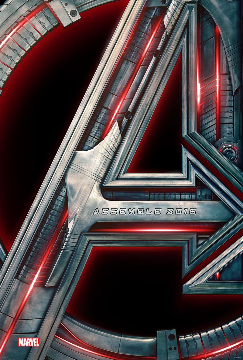
Avengers: Age of Ultron's logo kept the core shape but shifted to a deep-red metallic finish. The logo gave it an armored feel, visually echoing Ultron's robotic roots and the movie's darker tone.
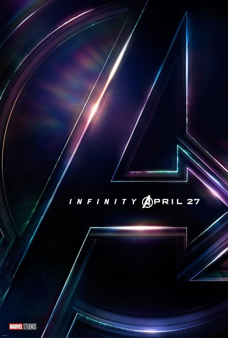
Avengers: Infinity War's logo broke the mold in more ways than one because the "A" became a prismatic emblem with shifting colors that emulate the six Infinity Stones. It also leaned toward the cosmic scale of Thanos' quest for superiority.
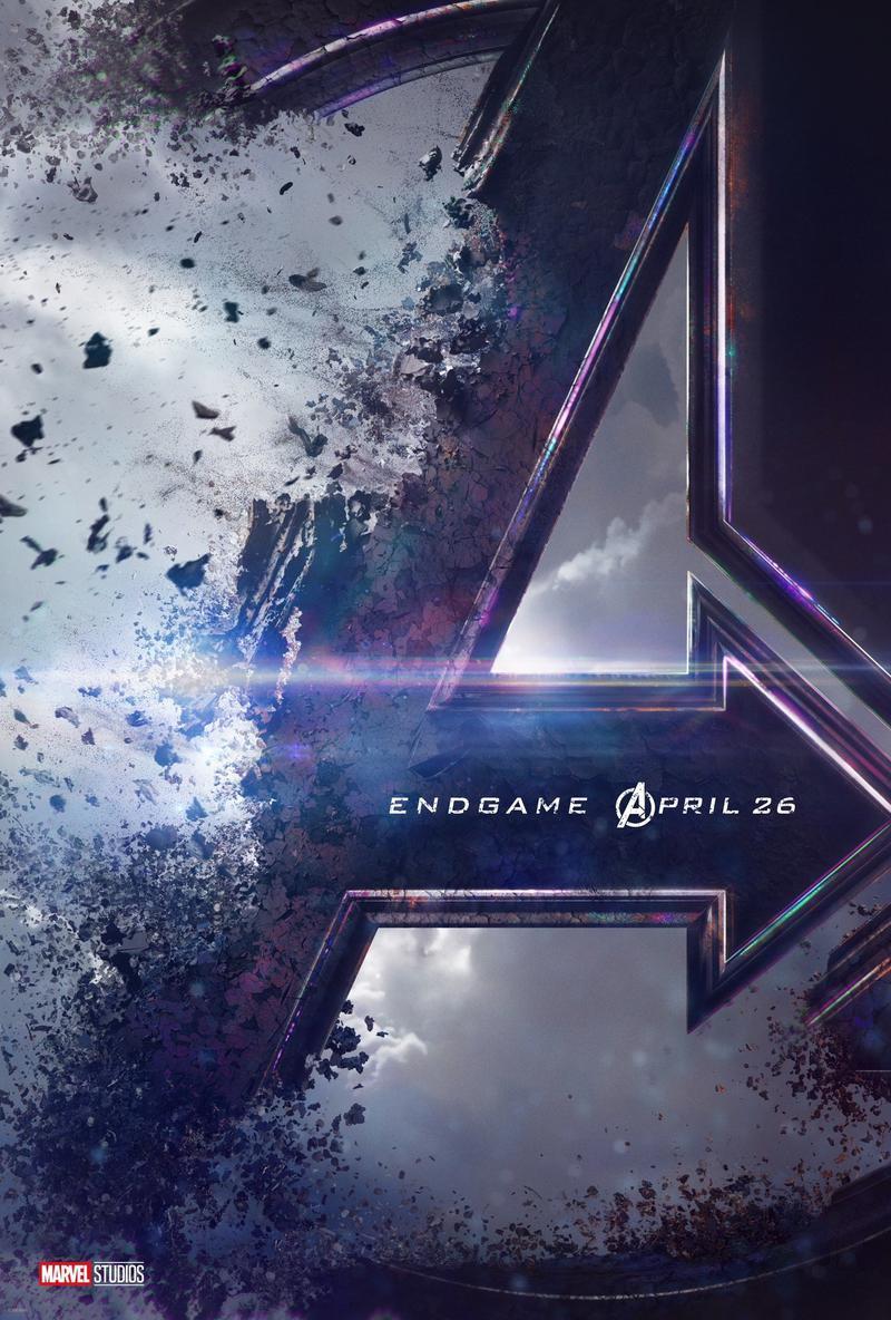
The Avengers: Endgame logo featured a purple-to-blue gradient with a battle-damaged aesthetic. What's unique about this logo is the "snap" effect, mirroring Thanos' dusting of half the universe that completely changed the MCU.
Overall, the Avengers logo has become one of the MCU's smartest pieces of visual storytelling, foreshadowing what's to come in the crossover films.
What Avengers: Doomsday's Logo Truly Hints at Doctor Doom's True Plan
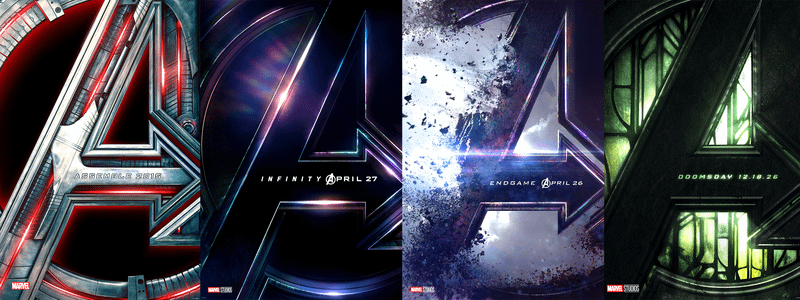
While previous Avengers "A" logos only hinted at a central threat, Avengers: Doomsday's dual approach underscores the full extent of the danger Doctor Doom truly poses. Doctor Doom represents an existential, all-encompassing threat that may eclipse even Thanos in scope and intimacy.
Thanos was a cosmic foe with a singular goal: to eliminate half of life to restore balance to the universe. Doom, meanwhile, is a personal tyrant, brilliant scientist, and master sorcerer hellbent on remaking everything in his image.
By pushing Doctor Doom's throne to the forefront, alongside the cracks forming within the Avengers logo, it seems that this is a hostile takeover, proving that, in hindsight, Doom is already winning. This level of visual storytelling is what makes Marvel Studios ahead of the game, raising the stakes for Avengers: Doomsday even before the film lands in theaters.
It's safe to assume that the Avengers won't just be fighting to save the Multiverse in Doomsday; they will also be fighting to reclaim their own symbol, tarnished by Doctor Doom's sinister schemes.