The brand-new trailer for Maul: Shadow Lord showcased a stunning new Lucasfilm logo that is on brand with its titular villain. The Lucasfilm logo has undergone many design tweaks over the years, starting with a major refresh in 2015's Star Wars: The Force Awakens, featuring a more refined chrome-silver look. The Lucasfilm logo redesign was more apparent in standalone movies, such as Rogue One and Solo: A Star Wars Story, due to their smaller size, which helped visually distinguish them from the Skywalker Saga entries. In 2026, Lucasfilm's logo received a major redesign that blends seamlessly with the show's gritty tone.
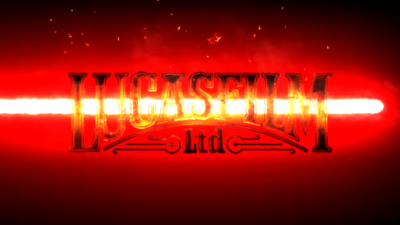
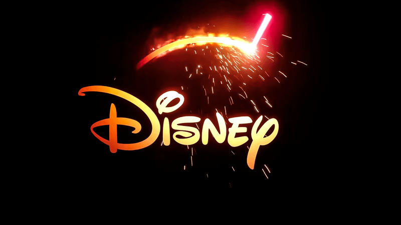
Maul: Shadow Lord's official trailer revealed a stunning new Lucasfilm logo with the titular villain's red lightsaber slashing through the middle. This stylized animation is the perfect fit for the upcoming Clone Wars spinoff, mainly because it embraces the gritty world and the anger-filled rage of Maul as he tries to exact his revenge against the Empire.
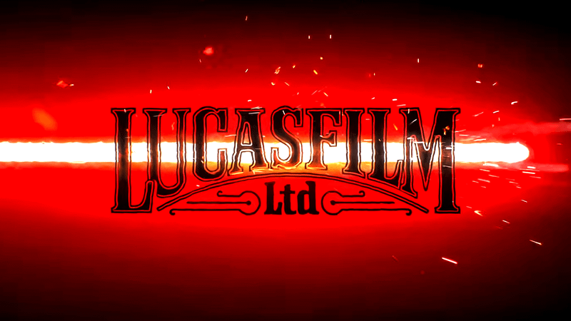
Another look at the refreshed design of Lucasfilm's logo showed the red glow of the lightsaber slightly more intense than in the first. This gave a clearer view of the logo, along with additional sparks and particle effects that made it feel alive and aggressive (similar to Maul's mindset in his 2026 return).
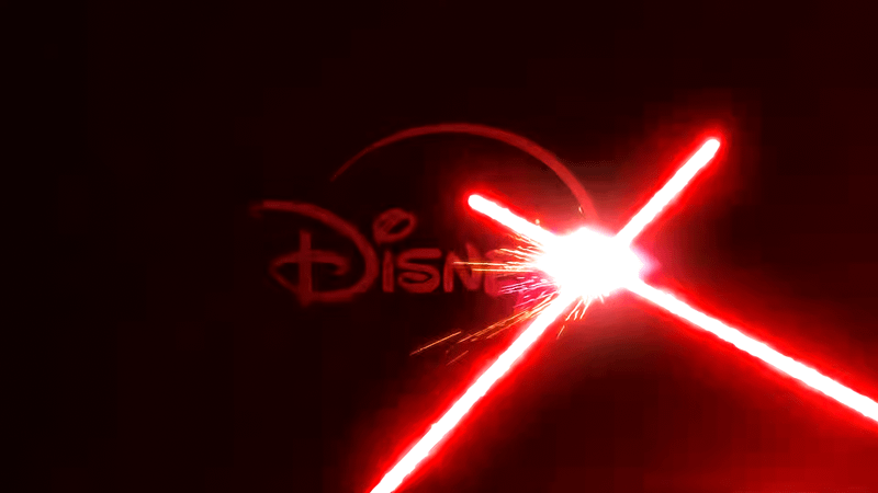
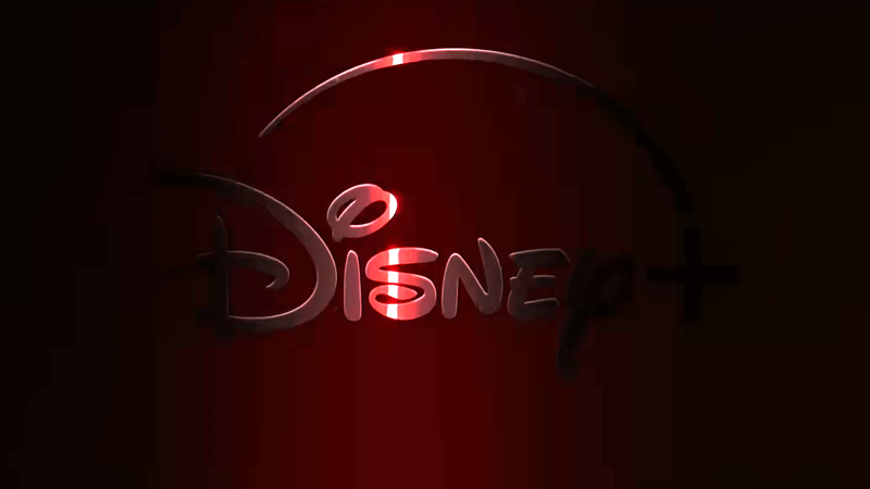
The Lucasfilm logo isn't the only one that received a slight tweak; the Disney+ logo was also updated, as it's set against a dark crimson background. The two red lightsaber blades locked in battle are also a deliberate choice to showcase the idea that there are many imminent (and possibly deadly) duels in the show.
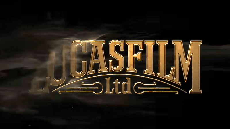
Other Disney+ shows are no strangers to slightly redesigning Lucasfilm and Disney+ logos. Obi-Wan Kenobi had a touch of Tatooine, showing its own take on the Lucasfilm logo with gold-embossed lettering and a sand-like particle effect to cement its connection to Luke Skywalker's home planet and the titular Jedi's hidden refuge in the series.
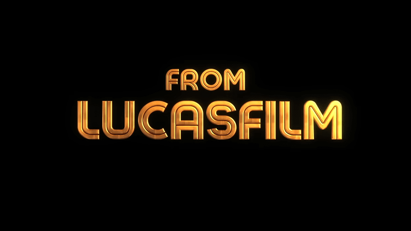
This "From Lucasfilm" redesign for Star Wars: Skeleton Crew completely abandons the classic logo treatment, instead featuring embossed 3D text that captures the show's adventurous, kid-friendly vibe.
The Disney+ logo of Obi-Wan Kenobi, combined with elements of the gold text design, leaning toward Tatooine, and a glowing red lightsaber beam that cuts through the logo, evokes the threat of Darth Vader's Inquisitors.
The Disney+ logo from The Acolyte has a deeper meaning. While the logo glows in a deep red hue that evokes the dark side, the fact that it is hidden contrasts with the idea that the Sith are still in hiding in this prequel series.
Meanwhile, this Disney+ logo is taken from Andor's promotional efforts. It showed a metallic, brushed-gold finish that seemingly evokes the emerging hope of the Rebel Alliance that is breaking through via their growing defiance of the Empire.
Fans can watch the official Maul: Shadow Lord trailer below:
Maul: Shadow Lord is set to continue the story of Maul following the events of The Clone Wars as he tries to rebuild his criminal empire on a distant planet amid the ongoing onslaught of the Galactic Empire.
The upcoming spinoff is set to have a two-episode premiere on April 6 on Disney+.


LATEST NEWS


