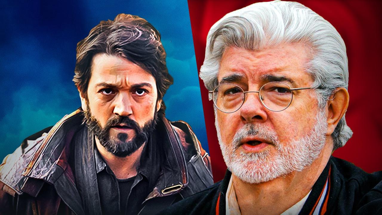
Andor creator Tony Gilroy needed to include one setting from George Lucas' Star Wars prequel trilogy in the Disney+ show, but he found it extremely difficult, as he didn't like the planet. Andor was an anomaly in the Star Wars universe for all the right reasons. Both seasons of the Disney+ show were acclaimed and widely regarded as among the best Star Wars content of all time; it was unlike anything the franchise had ever produced. While Gilroy did a good job of including places, characters, and weapons that appear throughout Star Wars, there was one location he didn't like at all.
In the art book titled The Art of Star Wars: Andor, series creator Tony Gilroy discussed some of the artistic decisions made in the Disney+ show and the influences from past Star Wars content. Specifically, Gilroy criticized George Lucas' version of Coruscant, one of the most famous and well-recognized planets in the prequel trilogy.
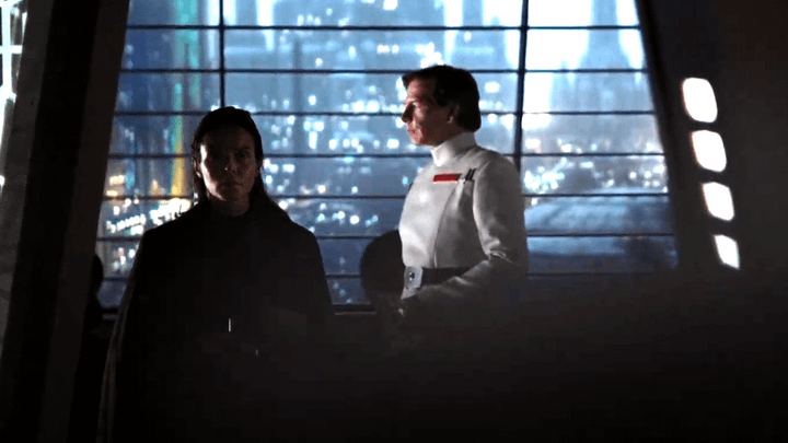
Gilroy said he didn't like Lucas' version of Coruscant, especially when it was included in Andor, because it didn't fit the vibe and tone of that series. The creator called Coruscant "really, really terrifying" and revealed which "piece of Corsucant" was "aesthetically consistent" with Andor. Turns out, it wasn't even a part of Coruscant that came from George Lucas:
"Like I said, that was really, really terrifying. The only piece of Coruscant that I liked, that really felt like it could be part of our show, was the bit that Gareth [Edwards] shot with Ben Mendelsohn and Mads Mikkelsen, a brief little flashback in 'Rogue.' That's the only piece of Coruscant that I thought was aesthetically consistent with what our show wanted to look like. So, we studied that. And then (ILM’s) Mohen (Leo) got involved."
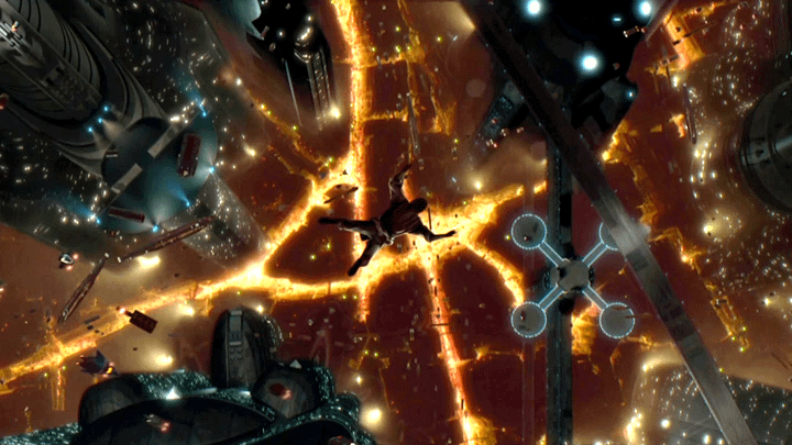
So, Gilroy seemingly knew from the start that he wasn't a fan of Lucas' version of Coruscant, as what he used for inspiration came from Rogue One and not even the prequel trilogy. That's not to say Gilroy outright disliked Lucas' design for the planet or called it poor. Instead, he was more noting that Lucas' version was more rooted in sci-fi, whereas Andor was a more grounded, gritty series, and the two aesthetics wouldn't have blended well.
That is not the only part of the art book that talks about what went into bringing Coruscant to life in Andor.
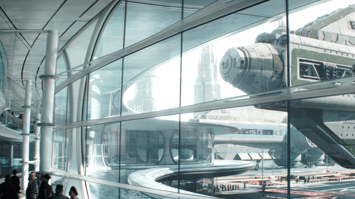
Another section detailed what was written down in Gilroy's design manifesto for the history-making show in 2019. In those notes, Gilroy talked about how he wanted Coruscant to look and what he wanted to leave out.
For instance, Gilroy's notes stated that if Lucas' version of Coruscant were used, it would "constantly want to pull you in a cheesy direction." However, he found some specifics that he would "need," and, in the end, wanted it to be "crazy, credible, and fascinating:"
"How do we take that aesthetic I was talking about on page one and deliver that to an environment like this that's gonna onstantly want to pull you in a cheesy direction? l’d need The Lower Depths and High Society I’d want non-Marvel funk and non-soapy, wealth-porn slick I’d want it vibrant but blemished. Crazy, credible, and fascinating."
Most of all, when everything else was stripped away, the creator wanted Coruscant to "feel like someone built it" and that it was "alive:"
"How to make these rooms and faces and décor - how to make it feel… real? – Lived-in and lush? How do you make it feel like someone built it? Someone cleans it? How do you make it feel like it goes off the frame?
Yes, It's got to be designed with a capital "D" and trippy with a big T- and yes its Star Wars, but if we're gonna live here for five years, it's got to be alive. It's got to have some error in it. I want an audience inside the story, not watching it. How do you get all that and avoid the cliche sci-fi chiaroscuro –"
Industrial Light & Magic's Mohen Leo, who was the VFX supervisor for Andor, also talked about Gilroy's vision for Coruscant in the art book. Like Gilroy, Leo also reiterated that the creator wanted nothing more than the planet to seem like "a place where normal people can actually live their lives."
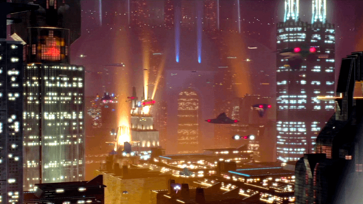
According to Leo, "in the prequels, (Coruscant is) very stylized." In Andor, it needed to be more grounded and "feel like a real place:"
"Tony basically said right from the start that he wants to set a lot of the action on Coruscant. But it has to feel like a real place. In the prequels, it's very stylized. But [for 'Andor'], it was super important that it feel like a place where you could, something to the effect of, not just walk into the restaurant, but walk into the kitchen behind the restaurant. And so that spun a lot of conversation with Luke Hull, as well. How do we make Coruscant like a place where normal people can actually live their lives?"
Production designer Luke Hull also mentioned what a challenge Coruscant was, calling it "the hardest stuff [he's] ever had to do:"
"The Coruscant stuff is the hardest stuff I’ve ever had to to do. Because you want the scale. But then, I really wanted to feel like an ant walking around that huge scale. Almost like it’s better to not understand it, tnot to have to see the whole thing. Like you’re just amongst it. That was very much the logic, I guess."
Hull also talked about what went into making decisions about the color scheme of the planet for Andor, revealing why they chose a more "monochromatic" look:
"I was referencing things like 'The Conformist' a lot for Coruscant. And I think what came through quite strongly was that it should be monochromatic. I suppose it was about different shades of white, warmer or cooler whiters. But it is also about being monochromatic, so that when you were back on Coruscant, you didn’t necessarily have to do a big establishing shot every time. You just knew aesthetically you were in that more clinical world."
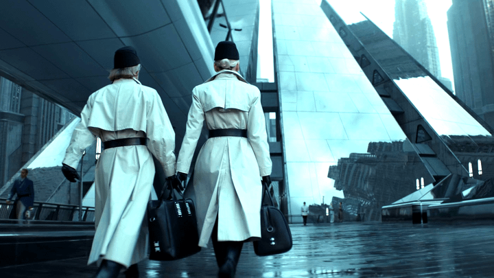
Gilroy also noted in the book that the team "didn't want to be dystopian or chiaroscuro" and didn't want Coruscant to feel like it was coming from a film like Blade Runner. In the long run, according to the creator, it "saved a lot of money" by making decisions like that early on:
"We didn’t want to be dystopian or chiaroscuro. We didn’t want to be that kind of 'Blade Runner'-y show at all. And so gradually figuring out, our game of design, and set extenstions, and quick decisions, and not changing our mind. We saved a lot of money by not changing our minds and being very direct and quick about things. But it was still very daunting."
Did Tony Gilroy's Version of Coruscant Work?
It is no secret that Tony Gilroy created a completely different version of Coruscant for Andor than fans were used to. The color had been stripped away, there weren't a ton of members from different species all around, and the planet as a whole seemed a lot more realistic.
Whether Gilroy succeeded in making Coruscant a better place than the prequels did is subjective. However, one can't argue that, in a way, it felt like a totally different planet, which can be both good and bad.
On one hand, it feeling different than the way it was portrayed in the prequels was good, because, as Gilroy stated, the vibe of Coruscant in the prequels would not have matched the tone of Andor. However, on the other hand, it is still the same planet in the Rogue One spin-off as it was in the prequels, so there is no significant reason for it to appear so vastly different, creating a bit of a disconnect between the saga as a whole.