
In the past, Marvel Cinematic Universe outings have gotten criticized for their color grading. In other words, many think the overall color palette tends to lead to flat-looking visuals - not enough color variety to make everything pop or offer a distinct style. The film that gets the brunt of those complaints is the Russo Bros.’ Captain America: Civil War.

Now, agree or not, it’s certainly not an argument that is true one hundred percent of the time. Guardians of the Galaxy and Thor: Ragnarok are two perfect examples that break the alleged ‘flat visuals’ mold.
With more advanced technology becoming available every day, the ways in which filmmakers can achieve depth in their frames are always expanding. Color is one of the key tools in achieving this, and it’s important that every project be aware of where they are on that front.
Now, Moon Knight’s cinematographer has spoken about how he avoided falling into that ‘flat’ camp
Moon Knight Cinematographer on MCU Visuals
In an exclusive interview with The Direct's Russ Milheim, the cinematographer for Moon Knight’s third and fourth episodes, Andrew Droz Palermo, talked about how they avoided the typical ‘flat’ visuals, working with all the white, and the horror influences seen within the series.
Palermo noted how “the comic books were a real North Star for [them]” while working on the series:
“Yea I mean the comic books were a real North Star for us I feel like, in that the visual style from some of those things. Plus just the way that it could go to such psychedelic places. You know, like a lot of the mental asylum, or hospital, stuff, that we ultimately get into my episode and episode five.”
He also revealed that Moon Knight's creative team “were looking to make a show which was a bit contrast-ier,” unlike how “historically [Marvel] things before [Moon Knight were] pretty middle-gray and pretty flat:”
“I think for us, even just visually, we were looking to make a show which was a bit contrast-ier, to have a bit more black to it. I think historically, Marvel things before us are pretty middle-grey and pretty flat. So we tried to build on the things that other cinematographers before me had done. To tweak little things. That was kind of one of our objectives to start with.”

When it comes to vivid color, the Guardians of the Galaxy films stand out from the pack in that regard. The James Gunn-directed franchise is one the filmmaker “[likes] quite a bit,” and would love to lend his talents to one day:
“I do like the Guardians of the Galaxy franchise quite a bit. I’ve never shot anything in space, like cockpit scenes or anything like that. So, [filming] something in space is pretty exciting. [Though] I know that that movie is about to happen, of course. Those movies seem fun.”
Palermo also revealed how he “grew up reading X-Men and Wolverine,” and that he “[liked] the first Doctor Strange [film],” tying his own background back to Marvel's history:
“You know I grew up reading X-Men and Wolverine. One of my best friends and I, when we were super young, we collected comic cards and we’d always draw from them. So I actually feel like I learned to draw from comic books. Both tracing, but also like trying to emulate the style of different artists. Then I’ve liked a few of the projects quite a lot, actually. And I like the first Doctor Strange, that was really great, it did some really cool stuff."
White is a color that tends to be the worst enemy of film—it’s known to be difficult to work with. Lucky for Palmero and his team, Moon Knight happens to be full of it. So how did they handle that?
Palermo confidently made it clear how “it’s just something you have to embrace:”
“I think it's just something you have to embrace. If you fight it, and you try to make him shadowy, or moody, you just won’t succeed [laughs] He’s always going to be the brightest thing in frame. The thing that the comic books does is that he can have a white side, and he can have a black side in the shadows, and you just can’t really do that when you’re filming. It’s really hard to make a white object appear black in the shadows. So we embraced what he looked like. There’s a great line that he wears white so people can see him coming. So with that sort of in mind, I never tried to hide him. I never tried to make him invisible, [instead I] allowed him to be white.”

He also noted that “white takes on every color around it,” which factored in when he lit environments like the city streets seen during Episode 2:
“The other aspect of that is, you know, white takes on every color around it. So, when we’re lighting with color, for the city streets, for instance, in episode 2, he would take on a lot of the sodium vapor lighting. It was just trying to find ways to make him a bit more neutral, where the rest of the environment can stay sodium.”
Another interesting obstacle came when the show reached the Mental Asylum in Episode 4. Palermo mentioned what helped make that work on screen was how “there’s nuance to the white,” including incorporating “cooler white vs. warmer white:”
“It is all white. Every object is white. But there’s nuance to the white. If you look at shots of Oscar [Isaac] when he’s sitting, talking to Harrow for the first time, everything is while, but there’s also the presence of cooler white vs. warmer white. So like, directly behind him it actually goes quite cool. So you set these sort of goal posts, and you work within those parameters, and you try to bring nuance in very small ways. At the end of episode 2 in the city streets I could put whatever color light everywhere. Everything’s motivated by city, so you have a much bigger parameter to work with.”
The show’s fourth installment also brought with it a heavy horror influence, something the cinematographer admitted “was a game of how much [they could] get away with:”
“I think for us, I think it was a game of how much can we get away with, and how much should we show. There’s definitely some violent things—when the Heka Priests was terminating one of of Harrow’s men on the slab. We overshot that scene, we shot a a number of different organs going into the canopic jars; you know, just [a] comedically large amount of those, knowing that they would only probably show one, and maybe for six frames or ten frames. For me at least, horror is best when things are left in the shadows. I’m left with my body tightening up, you know, and putting my fingernails into the couch and wondering what’s around the corner.”
The lighting was important for those scenes in the tomb, with Palermo wanting “one of them to be shadowy [and] one of them to be spooky,” and they always kept track of “how dark was acceptable:”
“So those two sets, I really, in devising the lighting, wanted one of them to be shadowy, one of them to be spooky. I love horror movies, I watch a lot of them. So I think I kind of just felt that we could go in that place, in this sort of episode which didn’t really—we never went back to that world. So I kinda could set my own world, which could be a little bit of a horror world. Then ultimately go to the mental institution, [and] that’s the end of that business. Even in color timing, we continued to nuance how dark was acceptable, how much we wanted to see the set dressing, how did we want to leave things in the shadows. I feel like we ended up in a pretty nice place, all things considered.”

Part of the creepy factor of Moon Knight was the inclusion of Khonshu, the Egyptian God of the Moon. So how did Palermo account for the size of the actual, in-story, being? It was a little bit of a trial-and-error approach, but made much easier thanks to “a 3D printed Khonshu head… on a huge stick:”
“So you would a frame a shot with that person standing in. But they also—VFX made a 3D printed Khonshu head, exactly as it looks in the show, and it was on a huge stick. So maybe the stand-in, or actor, would be there in costume, but we’d still need to bring in the head to accommodate for that large beak. Maybe I might find that I maybe I need to be a few feet further back to allow room for that beak, and allow it to come into the frame like I wanted. Or if he’s in profile, that I’m not chopping off the end of his beak. You frame as though it were a person, you leave the space for his entire face.”
So what was the filmmaker’s favorite sequence to pull off throughout his involvement on the Disney+ series? He admitted that he “really [likes the] storage locker sequence,” including the bit where Oscar Isaac’s Steven Grant is “running from Khonshu:”
“As simple as it is, I really like that storage locker sequence, both when he’s talking with himself and when he’s running from Khonshu. That was a fun lighting set-up to devise. Rather simple actually, just a bunch of lights overhead that run on a flicker pattern. But, to have anything that is written into the script where light is a character. It mentions that the light is approaching my motion sensor. Khonshu’s there and Khonshu’s not. You know that you have a chance to really become aligned with the story, and know that pushing it visually is important to its success. So, I really like that sequence. I love all of the mental hospital things as well, but getting to set that look is fun. It’s such a change of genre all of a sudden.”
At the end of the day, Palermo admits that he “learned a lot,” but one of the biggest lessons was to continue to learn “how to be a team leader,” which involved “a lot of people management:”
“I think working at scale is something here that I learned a lot. Working with a larger crew, and how to be a team leader for that, for those people. Because it’s not just like, ‘ I want to put the camera here and I want to shoot that shot.’ There’s a lot of people management, and people’s feelings, and my feelings, you know, dealing with the pressure. And how to set yourself up for success in these situations. Making sure you planned, have you asked yourself enough questions about the situation. It is weird how much being a cinematographer is being a manger, and not just being an artist. I guess I didn’t expect that when I was younger and I was shooting. You know, I thought it was like my will, whatever I think is beautiful, then I should chase that and I can push that. It’s [also] a lot more political than I think a lot of people probably expect."
Making the MCU Not-Flat Again

It's quite an achievement that Moon Knight excels in its visuals when the main character wears nothing but white. But as Palermo said, “white takes on every color around it;" thanks to some creative use of environmental lighting, the show was able to get past the roadblock many might not have ever even tried to get over in the first place.
One of the most impressive set pieces of the series was the mental asylum, which was made up of entirely white sets and objects. Yet, due to the unique utilization of warmer and cooler whites, something that should have come off as extremely flat ended up providing some of the most dynamic shots from the recent MCU adventures.
Hopefully, the special care and attention to detail that Moon Knight's Andrew Droz Palermo showed is also being kept in mind for the many other projects in development for Marvel Studios' future. With the sheer number of stories on the menu, the MCU is going to have to bring its A-game if it wants to continue to thrive going forward.
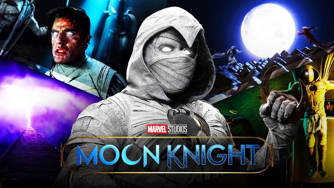
Moon Knight is now streaming exclusively on Disney+.


LATEST NEWS


