
With Zack Snyder's Justice League having been out for a few weeks now, fans have had time to digest it and pick it apart piece by piece. While at first it seemed like the film was a surprise hit for Warner Bros. , it now seems like that may not be the case. Something that fans won't be too happy to hear, especially after having campaigned for nearly three years.
Nonetheless, audiences got Zack Snyder's final vision. Alongside fans picking the four-hour epic apart, there have also been many interviews talking all about the changes and possibilities that this opportunity presented.
Recently in an interview with Zack Snyder and Weta Digital, they took a deep dive into one of their biggest redesigns: Steppenwolf . A very intricate, near endlessly plated armored suit, one that reacted to the wearer's emotions.
It seems like that design wasn't just in the running for Steppenwolf.
THE DARKSEID THAT COULD HAVE BEEN
An Instagram post from concept artist Jerad S.Marantz gives us a brand-new look at what Darkseid could have looked at in Zack Snyder's Justice League.
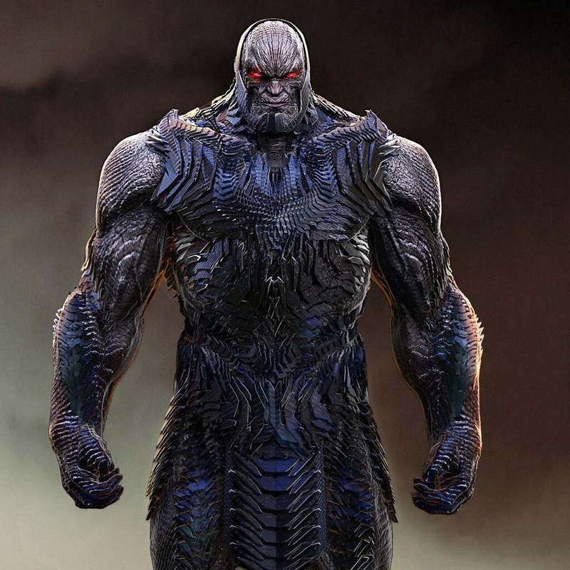
The first image gives fans an almost full-body look at the design, showcasing the Steppenwolf-like armor. The signature spiky armor that Steppenwolf wears throughout Zack Snyder's Justice League was one of the better additions to the film, so it's no surprise to see that it was being considered for the head honcho himself.
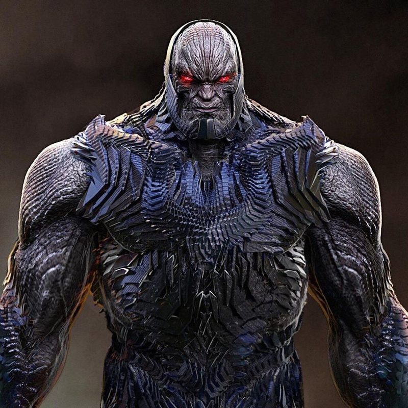
The second image is a closer mid-shot of Darkseid, which shows off two key things. The first being his signature logo is far less pronounced than it was in the final design. The second being the coloring becoming more prominent in this, with the blues popping more.
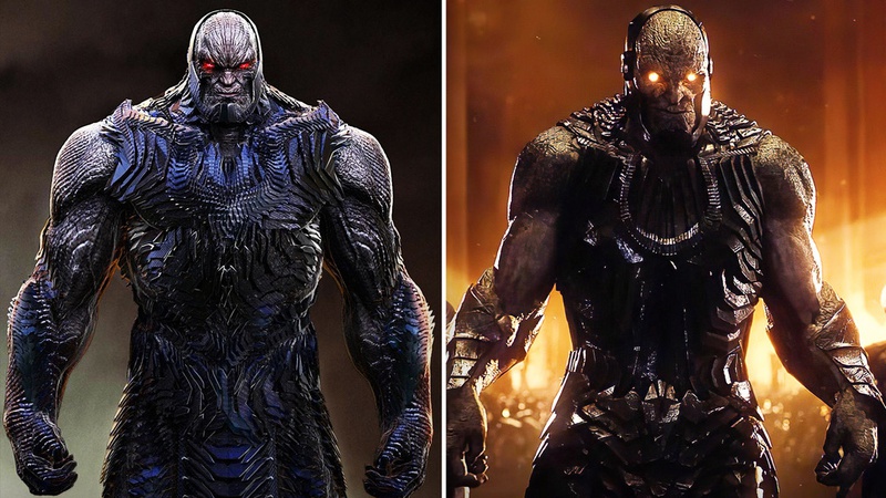
Now with this comparison image, the differences become clear. Color is all but absent in the design on the right (the final one), and there is far less plating going on with the armor. Darkseid's Omega symbol is clear and bold, whereas it's far more subtle on the left.
You can find the whole Instagram post below.
THE DARKSEID THAT WASN'T
Clearly in the end, the concept of the spiky and emotionally driven armor was fated for Steppenwolf, and him alone. Is that a bad thing though? There are some elements that are better for sure. The color being the key one, with another being his head design. Past that though, I think their final design wins out.
While Darkseid and Steppenwolf do hail from the same place, and the same culture, it's great that they both got different styles. It also makes sense that Steppenwolf has a different look, seeing as he was an outcast trying to earn his way back into the New Gods circle. Though, it's hard to deny that both of their designs could have used a little more color.
It would have been great to see Darkseid in action after having more attention, money, and time focused on him. It's very clear while watching the film that Steppenwolf, and how he looked/played on screen, was one of the top priorities for them. Darkseid seemed like an obvious rushed addition for most of his time on screen. While some scenes looked good, in others his presence was held back by an abundance of mediocre SFX.
It's sad that Ava DuVernay's New Gods was canceled , as it could have given fans either an expansion of what audiences saw, or a completely new and fleshed out take on Darkseid and his world.


